Paperless Prints
The term “print” is often used to refer to editions, reinforcing the idea that editioned artworks are two-dimensional works on paper.
With Paperless Prints, we present two new releases by Peter Halley and Cory Arcangel that are anything but traditional prints, and showcase a variety of other works from our archives that were indeed printed but not on paper. These works often do not require frames and are very close to being three-dimensional objects.
P E T E R H A L L E Y
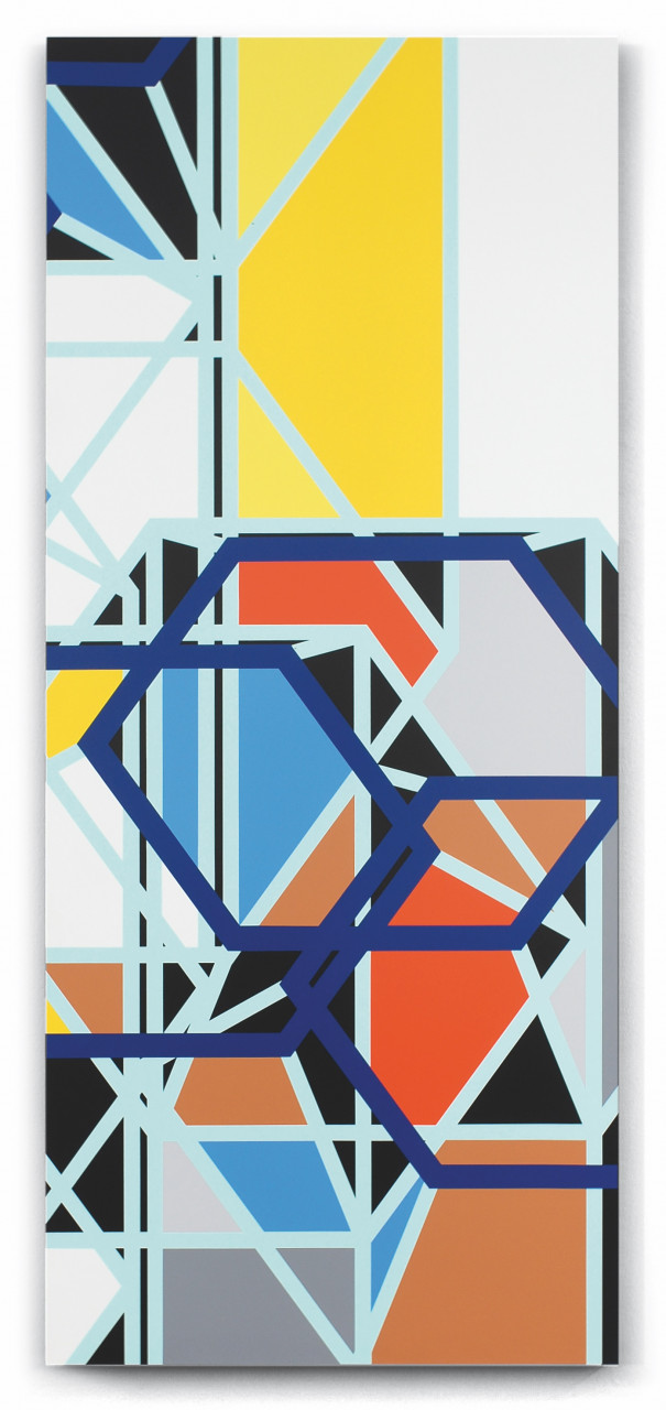
Our latest collaboration with Peter Halley, Glossary, is based on the artist’s first Heterotopia installation in Venice for the 2019 Biennale. Heterotopia is a concept defined by French philosopher and historian Michel Foucault to describe spaces parallel to the outside world – worlds within worlds, mirroring yet upsetting the outside, such as prisons and other institutional modes of confinement. Halley frequently uses prisons, cells, and conduits in his work, which represent the diagrammatic regulatory practices of modern social life, giving visual form to organisational systems that we find in everything from computer chips to corporations, buildings, and airports.
We had a chat with the artist to discuss how the Heterotopia series and this edition came to be.
Pauline Schellmann: When Jörg [Schellmann] saw the exhibition in Venice during the Biennale in 2019, he loved it so much, he approached you for an edition. This is a miniature version of the installations, but it has almost the same visual appeal and strength.
Peter Halley: As my installations are so ephemeral, it was really meaningful to me to make a piece that is a traditional artwork that would stay around. For the 2019 Biennale show, my goal was to create a series of rooms that had a narrative to them. The yellow prints were in the first room, with a cube in the middle; all of this was supposed to resemble an Egyptian tomb. These wall drawings are all reproduced from my sketchbooks from around 1981. I thought of them as imaginary hieroglyphics, so I reproduced them digitally and arranged them in different ways. I really liked the idea of taking something very old from a different time of my life and career and recycling it through the magic of digital reproduction. It was also interesting to take these very spontaneously drawn sketches and codify them into symbols.
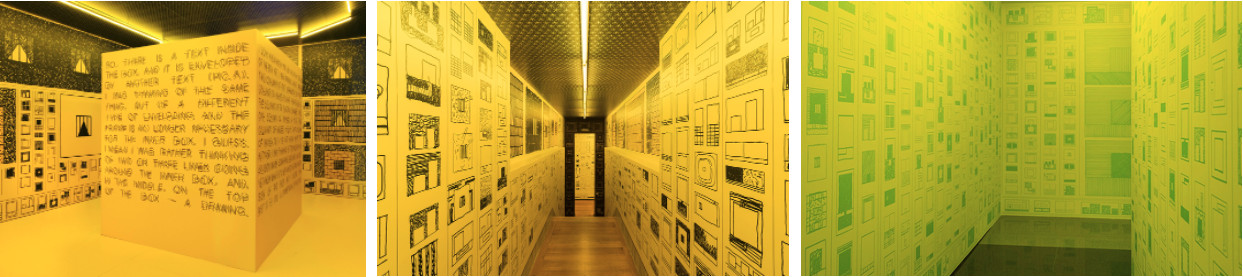
- 1. HETEROTOPIA I, 2019: Academy of Fine Arts of Venice, in conjunction with the Venice Biennale | 2. AU-DESSOUS / AU-DESSUS, 2018: Galerie Xippas, Paris | 3. New York, New York, 2018: Lever House Art Collection, New York
Pauline Schellmann: Is this why the work is titled “Glossary”?
Peter Halley: Yes, I thought this referred to the idea of hieroglyphics, that this was a glossary of symbols. Of course, they really are not a language and don’t form a syntax but I think they resemble ideograms or hieroglyphics enough to carry that idea forward.
Low Relief UV inkjet print, on aluminium and MDF board, painted with fluorescent acrylic, 80 x 87.5 x 3 cm (31.5 x 34.4 x 1.2 in). Edition of 15 + 4 AP, signed and numbered on label verso.
EUR 5,000
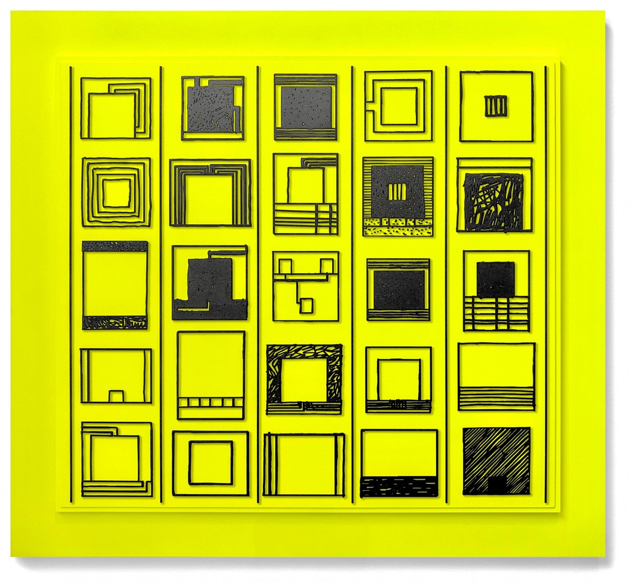
Schellmann: The making of this edition was rather complicated and a lengthy process. We had to find the right printing method – in order for the printing to work, the material must be perfectly flat, so a regular aluminium sheet didn’t work as it never is 100% flat. Thus, we used a relatively thin aluminium sheet that’s still somewhat malleable and placed it on a vacuum table to make sure it’s completely flat. Furthermore, getting the fluorescent yellow colour exactly right according to your instructions was not a simple task either. But it most certainly paid off, it’s such a beautiful piece.
Halley: I know how much hard work Glossary took to make and I’m very grateful for that. I don’t know if people will realise that when they see it because it looks so right. Although it does look like a complex object – anyway, I’m very proud of it.
Schellmann: It certainly does have some complexity to it simply because it has a lot of depth and texture.
Halley: Much of my work goes in the direction of low relief. As you know, my paintings and a lot of the editions I’ve made, including the fibre glass edition I did with Schellmann about 10 years ago, are all low-relief. In a sense, I think all good painting is low-relief. Nowadays, people tend to think of paintings as images but they’re also surfaces. When you think of a painting of van Gogh, even before you think of the image, you think of the texture of the brush strokes going across. Or Anselm Kiefer, it’s all about texture. I think that’s a basic component of painting and a reason we still have paintings and not just photographs.
Schellmann: We love producing 3-dimensional or relief editions because it does make the works more interesting and gives them complexity. The works you’ve published with Schellmann are also quite diverse in terms of size, media and dimensionality.
Halley: That’s partly because Jörg always has new ideas for editions, which in turn helps me think about how I’m going to make that new kind of edition. I’m thinking of the leporello, which was a simple digital print, but it’s on rice paper and it’s folded. I have one at home and it almost feels like a Japanese print, so that was a lot of fun for me to make.
I’m also appreciative because I avoid making prints that look like my paintings and Jörg has always been very open to that. In a way, my printmaking hero is Beuys, because his projects were so adventurous and each edition had something to say, they were not simply copies of something else. So, I appreciate this collaboration and the fact that the editions are in a sense experimental and not necessarily or primarily commercial.
Schellmann: Is being able to experiment in this way part of what makes working with the medium of editions interesting to you?
Halley: Yes, curiosity and exploring new ways of making things. Almost every edition I’ve done has involved non-traditional techniques. I’ve only done one etching, one lithograph. I am known for my early use of digital media. But this new edition has been a real experiment in creating thick three-dimensional lines with digital ink. When people think of digital prints, they think of flat surfaces. So, for me, this was a way to experiment with using the latest flatbed printers to create textural images.
C O R Y A R C A N G E L
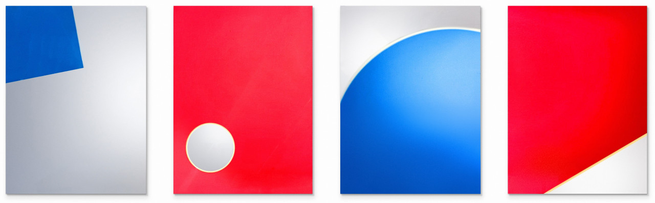
(RR) marks our first edition collaboration with Cory Arcangel and is based on the artist’s series of Photoshop Gradient Demonstrations that anchored his position as one of the leading contemporary artists exploring the intersection of digital technology and art. Read our conversation with the artist below to learn more about this new series of editions and why it took over 10 years for these works to be realised.
Pauline Schellmann: We've had your new (RR) series on the wall in our gallery space here in Munich and it’s been such a delight, every day, to see them change their appearance based on different lights – artificial or natural, indirect or direct, and of course the mirror effect. Mirroring and these types of transitions are a common theme in your works – can you expand on this choice?
Cory Arcangel: My tendency is to use things that are around me, easily within my reach. This particular series – the Photoshop Gradient Demonstration series – started in the same spirit because these patterns were just built into Photoshop. So, the Russel’s Rainbow (that’s where the title of the series comes from) was a rainbow effect pattern that was just built into the application. It was a sort of laziness, or in other words, a sort of readymade gesture that I started using these Photoshop patterns.
Around 2010, I tried to figure out a way to produce them by having them printed on a standard mirror – replacing one of the colours with "nothing", thus the -B and -R in the titles. But I couldn’t get it to work; I was working with commercial printers, and we just couldn’t quite get it to work so I dropped it until I had the idea of finishing it with you. When Jörg [Schellmann] contacted me once more to do an edition, that was the missing piece of the puzzle and I could finally finish it.
Series of four UV digital pigment prints in colors with matt protective coat on mirrored plexiglass, mounted on aluminum frame:
1. Photoshop CS: 40 by 30 inches, 300 DPI, RGB, square pixels, default gradient "Russell's Rainbow" (turn transparency off), mousedown y=1960 x=2020, mouseup y=4400 x=5640 (- R), 2010/2023
2. Photoshop CS: 40 by 30 inches, 300 DPI, RGB, square pixels, default gradient "Russell's Rainbow" (turn transparency off), mousedown y=9040 x=2460, mouseup y=10040 x=1040 (- B), 2010/2023
3. Photoshop CS: 40 by 30 inches, 300 DPI, RGB, square pixels, default gradient "Russell's Rainbow" (turn transparency off), mousedown y=9400 x=7200, mouseup y=1640 x=1640 (- R), 2010/2023
4. Photoshop CS: 40 by 30 inches, 300 DPI, RGB, square pixels, default gradient "Russell's Rainbow" (turn transparency off), mousedown y=560 x=2160, mouseup y=2300 x=3160 (- B), 2010/2023
Each 101 x 76 x 1.3 cm (39.8 x 29.9 x 0.5 in)
Edition of 25 + 3 AP + 1 HC, signed and numbered on label verso
Set EUR 8,500
Schellmann: Your titles are very transparent, revealing the code one would enter into Photoshop to create the image. You also update your Are.na channel consistently to share what you’re working on. Why is this level of transparency important to you?
Arcangel: In one way, I am quite isolated and remote, living in Norway. But I am also a contemporary art enthusiast – I like the whole game and I especially like the behind-the-scenes stuff. What does my favourite artist’s studio look like, what is their infrastructure, what are they doing at 2 o’clock, how does this stuff actually get made?
My Are.na channel is a bit of a flashlight to show how my artworks get made. Unlike music or comedy, there is very little writing or press or podcasts about the behind-the-scenes in the contemporary art industry. So, it’s a bit of a mystery for people. And because I wasn’t educated in art, when I first started, I was annoyed that I couldn’t figure out how it all worked. How do you make a show, how do you know when something is done? All of that was a total mystery. So I like to think that maybe there is some kid out there now that could use this help.
Schellmann: Historically, editions are the more democratic, approachable version of unique artworks. How does that complement your artistic practice? What are your thoughts on that medium?
Arcangel: Definitely that I haven’t done enough, that would be my number one thought. I would sell a lot of posters off my website when I was younger, so it’s always been a part of my practice and I have always liked the idea of people just being able to go to a website and buy something. More before corona, I had Arcangel Surfware, which was also a publisher of editions, and had an IRL shop in Stavanger for a few years.
What got me pumped recently was the ars publicata site – even that information was kind of secret, so to see something like that is exciting. And then I saw my profile, and I thought I need to do more to add to it!
The Photoshop series has only been very high-end so I thought it was a good idea to do an edition of them so there would be a chance for other people to have them. Now that the series has wound down, this is a good time to publish them as an edition. Jörg was chasing me for so long – he was so gentle and patient – that I think it took 10 years for us to do this. But at the end of corona, I came to visit him in Munich and it was so fun to see your space with all the crazy artworks, and to discuss and start this edition project. It’s been thrilling to see it unfold in this way, where the time is right and the wind is blowing gently in the right direction. And of course, you all had the expertise to figure out how to print perfectly a digital image on a mirror!
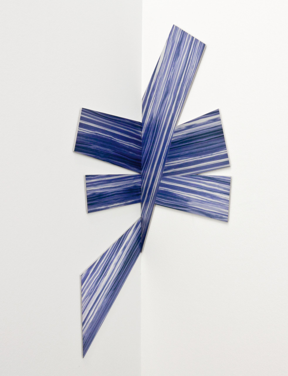
more paperless print works from our archives:
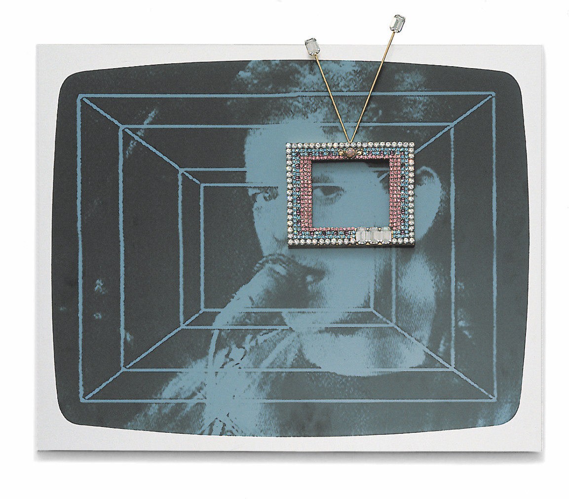
(still of Lou Reed from video Bye Bye, Kipling)
Silkscreen on aluminum, brass, rhinestones, 45 x 56 x 3 cm. Edition of 40, signed and numbered.
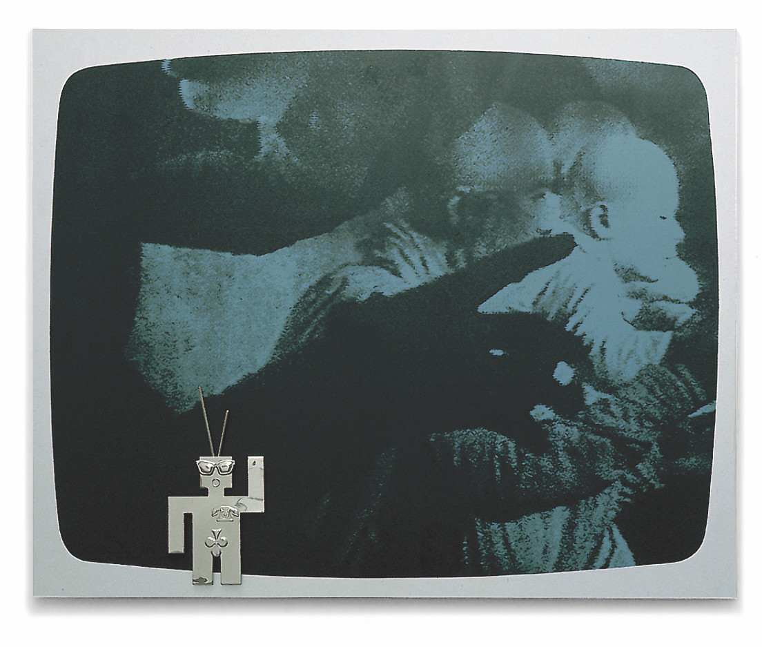
(still of Sankai Juku Performance Group from video Bye Bye Kipling)
Silkscreen, on aluminum, stainless steel, 45 x 56 x 2 cm (17¾ x 22 x ¾ in). Edition of 40, signed, numbered.
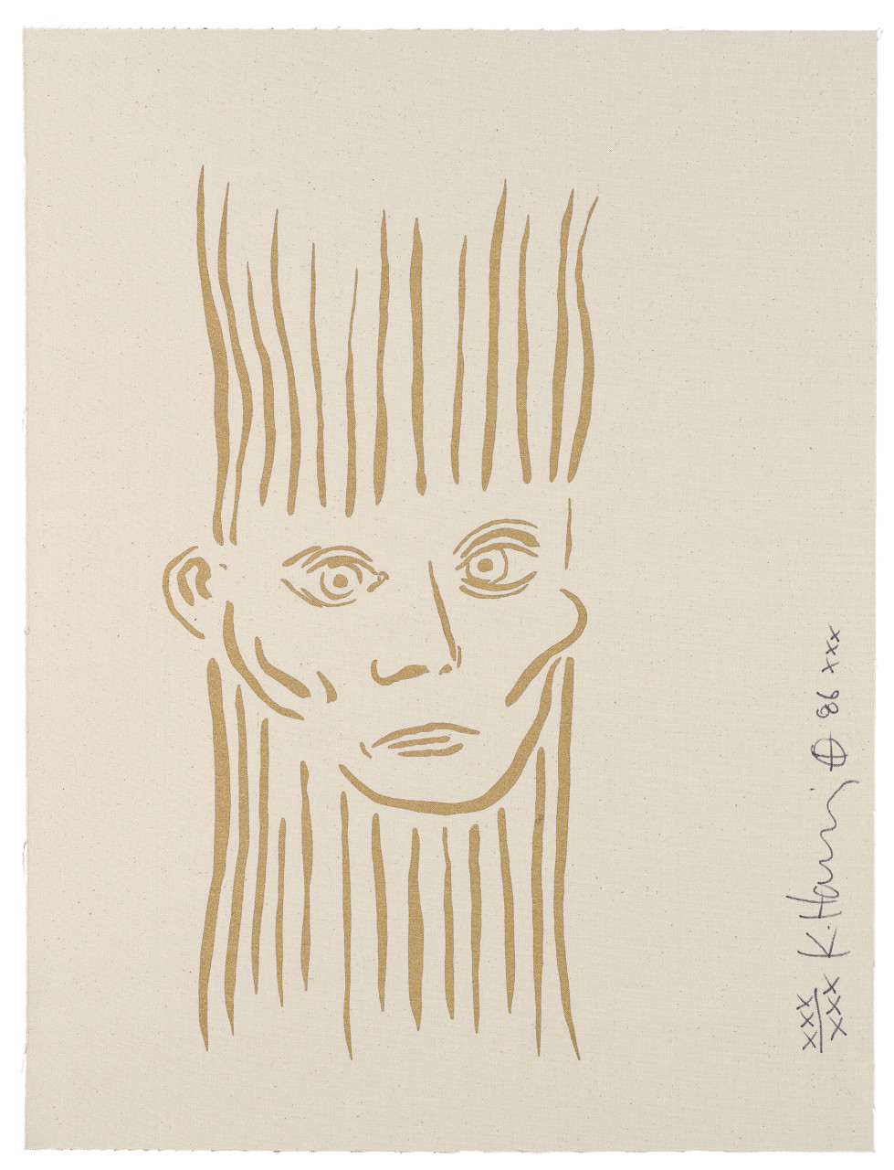
From For Joseph Beuys
Silkscreen on natural or white canvas, 80 x 60 cm (31½ x 23 in). Edition of 90 + XXX, signed and numbered.
Published for the 50th Venice Biennale
Silkscreen behind acrylic glass, with metal brackets, 60 x 60 x 1 cm (23½ x 23½ x ¼ in). Edition of 50, signed and numbered on separate certificate.
EUR 2,200
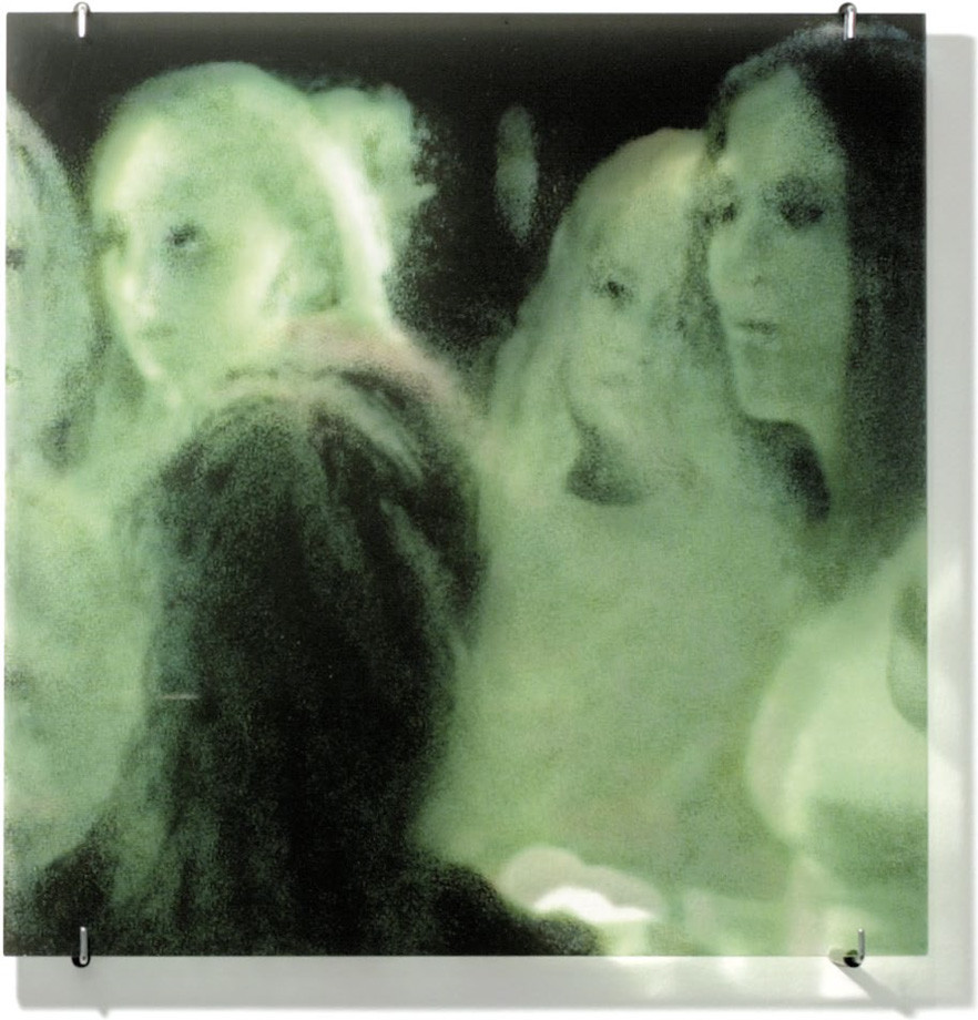
From Sequences
Three acrylic glass mirrors, printed with silkscreen. Each print 50 x 40 cm (19¾ x 15¾ in), signed and numbered on verso. Edition of 60 + X.
Set EUR 6,000

Published for Haus der Kunst, Munich
Silkscreen on galvanized iron, 51 x 19 x 12 cm (20 x 7½ x 4¾ in). Edition of 100, signed and numbered.
EUR 1,200
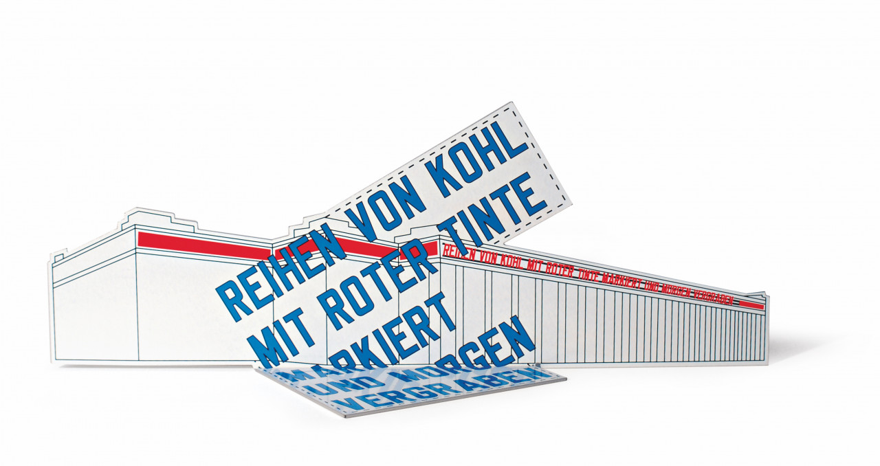
From Door Cycle
Thermo enameling on security glass plate. Size: 200 x 90 x 0.9 cm (78¾ x 35½ x ¼ in). Edition: 15, signed and numbered on separate label.
EUR 12,000
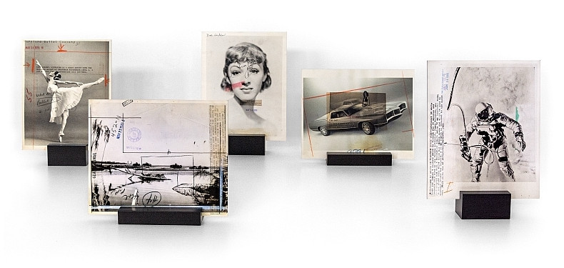
Fujiflex, mounted on aluminum (Dibond). 24 images, different sizes from 21 x 23 to 21 x 30.8 cm (8¼ x 9 to 8¼ x 12 in). Edition of 15 each, signed and numbered on verso, on stand.
All images are available individually.
Each EUR 2,400
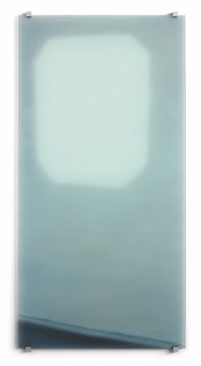
Silkscreen and hand-painting on antiqued mirrored glass, 58 x 45 x 0.5 cm (23 x 18 x ¼ in). Edition of 99, signed and numbered on label.
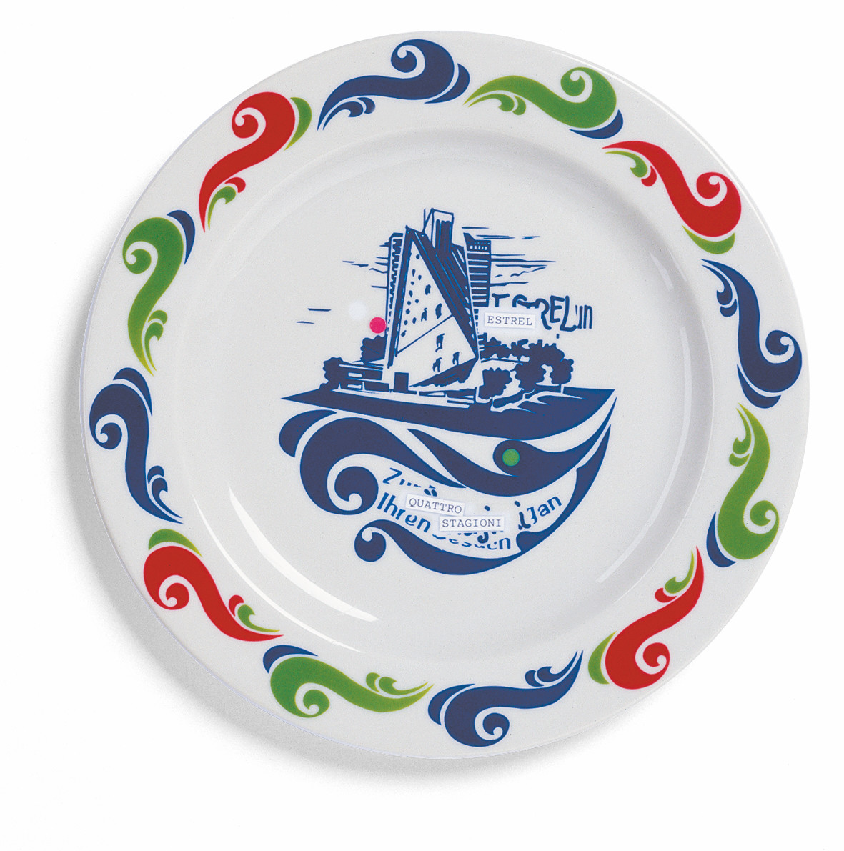
Published for Documenta 11
Porcelain plate, baked silkscreen, 24 cm diameter (9½ in). Edition of 80, signed and numbered.
EUR 400
From Door Cycle
Screenprint on both sides of an Amphibolin-primed wooden door panel. Size: 200 x 90 x 4 cm (78¾ x 35½ x 1½ in). Edition: 15, signed and numbered on separate label.
EUR 8,000
EUR 18,000
From Door Cycle
Silkscreen on metal door panel 211 x 90 x 4.5 cm (83 x 35½ x 1½ in). Edition: 15, signed and numbered on separate label.
EUR 24,000