Sequences, 1998
A collection of prints
Portfolio of diptychs and triptychs, altogether 78 prints, 50 x 40 or 40 x 50 cm in different media by 29 artists. Edition: 60 + X (+ varying number of proofs), all prints signed and numbered by the artists.
Since the beginning of the 60s, the concept of the series has dominated contemporary art. No longer is the single work – painting, drawing or print – in the focus of interest, but the sequence of works, mostly of the same format. Thus, each work consists of multiple elements, only the entity of which makes it a complete work of art. In Pop art, the sequential arrangement of works derives from the multiplicity or even endless repetition of images in the media. Jasper Johns' and Robert Indiana's Numbers, Andy Warhol's serial color or print variations of second-hand images are typical examples of that general art practice of the Pop Art era.
print catalog pages of entire project
Even more so in Minimal and Conceptual art has the serial order of works become the predominant principle of making art. The series serve to develop an idea in steps (A, B, C, D, etc.) or to examine variations (A1, A2, A3, etc., B1, B2, B3, etc.), or to emphasize differences in shape, color or proportion, in which case the crucial idea lies in the steps, in the space between A, B, C, and D etc. Artists like Frank Stella, Donald Judd, Dan Flavin, Sol LeWitt, Hanne Darboven, and Daniel Buren and many others have celebrated the sequence, the series, and thus created fundamental, new aesthetics in contemporary art, with great influence on design, graphic design, and architecture. The concept of the sequence also reflects our more filmic use and consumption of images in our time.

")

Running Fence, Sonoma and Marin Counties, California 1972-76

Künstlicher Marmor, Kirche Neuenfelde, Harburg Elbe Nord
")


Lev Lvovich's "Coincidences"


L'essence de la rhétorique est dans l'allégorie IV
")


Triangle, Trinity

")


Duchamp Triptych


Hochofen, Ilsede/Hannover
1998
From Sequences
Two duotone offset lithographs on white board. Each print 50 x 40 cm (19¾ x 15¾ in). Edition of 60 + X + 12 A.P., each signed and numbered on verso
Bernd and Hilla Becher's photographs of blast furnaces show prototypical plants that have been in operation across Europe and the USA since the 1960s. The photographs were taken either during their use or shortly after their decommissioning. As central elements of the steel industry, blast furnaces were used to produce pig iron and, with their characteristic architecture, they shaped the appearance of industrial regions. Their unmistakable shape makes them both a symbol of steel production and an iconic testimony to industrial culture.
Set EUR 4,000
Price incl. VAT, plus shipping
Dispatch within 2–5 business days

1 + 2 = 3 (Triptych)
1998
From Sequences
Three-part woodcut on rag paper, 50 x 40 cm (19¾ x 15¾ in) each, printed in red, green, blue or yellow. Edition of 60+X, signed and numbered on certificate.
Buren follows a strict code of form based on the stripes of a classic awning fabric. A trivial pattern becomes worthy of art. Work 1 plus work 2 equals work 3. The spacing is that of a continuous sequence of 8.7 cm wide stripes and results in a stringent structure.
For 30 years, the vertical stripes of 8.7 cm width, have been the constant element in the works of Buren, who has systematically investigated their artistic potential in paintings, objects and most often, in site-specific public installations. The artist explains: "In the years 1965-1966, I found the striped fabric with which I could first execute a personal, later a radical criticism of the artworks – by reducing my own activities to something more or less desperate, more or less in vain."

Running Fence, Sonoma and Marin Counties, California 1972-76
1998
From Sequences
a: Grano lithograph with collage, printed in eight colors on Fabriano rag paper;
b, c: Two heliogravures, printed in four colors on Rives BFK rag paper.
Each print 40 x 50 cm (15¾ x 19¾ in), each signed and numbered. Edition of 60 + X.
The art project Running Fence by Christo and Jeanne-Claude was the result of 42 months of intensive preparation, including public hearings, legal proceedings, and a comprehensive environmental review. It was financed through the sale of preliminary studies and artworks by the artist duo. The temporary installation consisted of 160,000 m² of white nylon fabric, attached to a steel cable between 2,050 six-meter-high steel poles. The structure was anchored without concrete and secured with tension cables. After just 14 days, the fence was completely dismantled in accordance with agreements with authorities and landowners, leaving no trace in the landscape. The Running Fence crossed 14 roads as well as the town of Valley Ford and was visible over a distance of 65 km, while still allowing passage for cars, livestock, and wildlife.
This edition captures the ephemeral artwork and illustrates its conceptual and aesthetic significance within the overall work of Christo and Jeanne-Claude.
Set EUR 5,000

Künstlicher Marmor, Kirche Neuenfelde, Harburg Elbe Nord
1998
From Sequences
Three grano lithographs, printed in six colors on Rives rag paper. Each print 50 x 40 cm (19¾ x 15¾ in), each signed and numbered. Edition of 60+X+10 A.P.
This work, consisting of three grano lithographs, represents a rare and remarkable departure from Hanne Darboven's characteristic black-and-white, grid-like works. Printed in six colors on Rives BFK paper, they feature intricately drawn marble structures discovered in the artist's hometown neighborhood of Harburg. Each lithograph in this edition is titled and labeled accordingly, expanding Hanne Darboven's conceptual approach with an unexpected visual opulence.
Set EUR 1,000
Price incl. VAT, plus shipping
Dispatch within 2–5 business days

Untitled (Triptych)
1996-1998
From Sequences
Three aquatints printed from two to three plates each on Twinrocker handmade rag paper. Each print 50 x 40 cm (19¾ x 15¾ in). Edition of 60+X, each print numbered and estate signed by the artist's son, Stephen Flavin on verso.
Since 1961, the artist Dan Flavin used almost exclusively the industrial fluorescent tube as his material; his focus was not on the arrangement of the light sources but on the effects of their complex colored light within an interior space. In his few monochromatic editions on paper, Flavin does not illustrate the fluorescent light itself but rather proposes a translation of color and light into the graphic medium.
price on request

Happy Clinique
1998
From Sequences
Three mixed media prints (silkscreen and offset lithograph) on glossy coated board. Each print 50 x 40 cm (19¾ x 15¾ in), each signed and numbered on verso. Edition of 60+X.
Fleury exploits elements of fashion in her works, using its formal principles or the highly recognizable images created by the fashion industry. She does this without taking a critical position towards the mechanisms of the market or of consumption. She is merely interested in the principles of fashion and the investigation of its aesthetic and conceptual aspects. By applying artistic means to the phenomena of fashion, Sylvie Fleury releases them from their transitory nature so they become blueprints for thinking.
EUR 2,700
Price incl. VAT, plus shipping
Dispatch within 2–5 business days

Coda
1996-1998
From Sequences
Three etchings on Rives BFK rag paper. Each print 50 x 40 cm (19¾ x 15¾ in). Edition of 60+X, each signed and numbered.
Günther Förg’s Coda editions, named after a poem by Ezra Pound, are a striking exploration of abstraction and the impact of color. Characterized by broad vertical bands in vivid tones against a textured background, these works reflect Förg’s nuanced understanding of spatial relationships and surface depth. The restrained yet contrasting color palette creates a rhythmic dynamism, highlighting Förg’s ability to evoke emotional resonance through abstraction.
Set EUR 5,000

Alf and Fritz / Volcano
1998
From Sequences
a: Alf Bold Dead, August 18, 1993;
b: Fritz Five Days Old, August 18, 1993;
c: Stromboli at Dawn.
Set of three Ilfochrome prints. Each print 40 x 50 cm (15¾ x19¾ in), set signed on image b. Edition of 60+X.
Nan Goldin on this edition: "On August 18, 1993 I spent the day by the bedside of my best friend Alf Bold listening to his death-rattle. I left the hospital briefly to meet my friend Hans Werner's newborn son, Fritz. When I returned to the hospital an hour later Alf had died."
Set EUR 3,300
Price incl. VAT, plus shipping
Dispatch within 2–5 business days

Somebody / Nobody
1998
From Sequences
Two silkscreens, printed in 23 or 14 colors (Day-glo, metallic and pearlescent), with embossing, on Arches rag paper. Each print 50 x 40 cm (19¾ x 15¾ in), each signed and numbered. Edition of 60+X.
Peter Halley on this edition: "In this pair of prints, I have, for the first time, begun to work with metallic and pearlescent paints I'm using in my new paintings. Employing these shimmering hues, whose appearance is so easily altered by the subtleties of their application, has been a true test of the printmaker's art."
Set EUR 4,000
Price incl. VAT, plus shipping
Dispatch within 2–5 business days

Dancing Giraffe Tree
1998
From Sequences
Two soft ground etchings on dyed transparent Japanese paper, collaged on Hahnemühle etching paper. Each print 50 x 40 cm (19¾ x 15¾ in), each signed and numbered. Edition of 60+X.
Rebecca Horn constructs ensembles of discrete, often kinetic parts to create evocative, almost theatrical, installations. The central and connecting theme of her works – in sculpture, installations, drawings and prints – is the transmission and free flow of energy which the artist directs into poetic ensembles, often suggesting a surreal expression.
Set EUR 1,200
Price incl. VAT, plus shipping
Dispatch within 2–5 business days

Lev Lvovich's "Coincidences"
1998
From Sequences
Two silkscreen and offset lithographs on Somerset rag paper. Each print 50 x 40 cm (19¾ x 15¾ in), each signed and numbered. Edition of 60+X.
The two editions titled Levlvovich’s Coincidences refer to a work series of the same name by Ilya and Emilia Kabakov. In this reference, a multi-layered play with narration and memory unfolds – characteristic of the Kabakovs’ conceptual practice.
Set EUR 1,200
Price incl. VAT, plus shipping
Dispatch within 2–5 business days

Untergang
1998
From Sequences
Three lithographs, printed from three to five stones on Velin Arches rag paper. Each print 50 x 40 cm (19¾ x 15¾ in), each signed and numbered. Edition of 60+X.
Per Kirkeby’s lithograph Athos (1999) captivates with a central, luminous red framed by fields of yellow. Only upon closer inspection does a complex texture of hatching, smudges, and scratch marks reveal itself. The yellow areas condense into rock-like structures – a nod to Kirkeby’s geological interests. The title of this edition refers to Mount Athos, a spiritual center known for its centuries-old monasteries and caves. Kirkeby plays with ambivalence: the red forms at the center of the image open like mysterious mouths, their meaning remaining elusive. With masterful use of lithography, he merges delicate drawing with painterly depth and vibrant color dynamics.
Set EUR 2,400
Price incl. VAT, plus shipping
Dispatch within 2–5 business days

Tür und Tor
1998
From Sequences
Three-part print: Two silkscreens, printed with phosphorous pigment, and mezzotint, all printed on Rives BFK rag paper. Each print 40 x 50 cm (15¾ x 19¾ in), set signed and numbered on verso of mezzotint. Edition of 60+X.
Imi Knoebel’s edition Tür und Tor [Door and Gate] unfolds as a rigorously composed sequence of three prints, in which two rectangular forms—A and B—appear in varying arrangements. The series follows a reduced logic: first in the combination A+B, then A in isolation, and finally B. This principle of alternating presence and absence creates a subtle play of positive and negative forms that challenges the boundaries between figure and ground.
Set EUR 3,000
Price incl. VAT, plus shipping
Dispatch within 2–5 business days

Fun
1998
From Sequences
Three grano lithographs on Biber GS coated board. Each print 50 x 40 cm (19¾ x 15¾ in). Edition of 60+X+15 A.P, each signed and numbered on verso.
This edition by Jeff Koons is closely related to later works like Donkey, which references the donkey character from Winnie-the-Pooh while parodying the visual dominance of Disney aesthetics in mass culture. These works are part of the Easyfun series, where Koons uses sculptural mirror objects – often in the form of stylized animals – to explore the interplay between art and consumerism.
Set EUR 7,500

L'essence de la rhétorique est dans l'allégorie IV
1998
From Sequences
Three-part aquatint and heliogravure on Rives BFK rag paper. Each print 40 x 50 cm (15¾ x 19¾ in), signed and numbered on second print. Edition of 60+X.
With this edition, Joseph Kosuth references a René Magritte painting, L'apparition (1928), in which amorphous elements are a repeated motif. These "clouds of language" contain the major concepts of Michel Foucault's essay Ceci n'est pas une pipe from 1973, in which the French philosopher investigated the semiotic character of Magritte's word pictures. Kosuth has described his projects as investigations which examine the conceptual and representational shifts between the identity of words and the reality of things.
Set EUR 1,750
Price incl. VAT, plus shipping
Dispatch within 2–5 business days

Senza titolo (Trittico)
1998
From Sequences
Three lithographs, printed from one stone on Sicars rag paper with collaged newspaper, folded and printed over with a second stone. Each print 50 x 40 cm (19¾ x 15¾ in), each signed and numbered. Edition of 60+X.
In this edition, Jannis Kounellis employs elemental, culturally charged materials such as iron, coal, and fire – central elements of his oeuvre. The three sheets are almost entirely blackened with dense charcoal hatching, creating a profound sense of materiality. Placed upon them are folded newspapers, also blackened – an act of deliberate erasure of information that simultaneously generates a new, enigmatic visual language. Through the layering of mediated content and raw matter, Kounellis explores the tension between the written and the unspoken, documentation and forgetting, visibility and concealment.
Set EUR 2,700
Price incl. VAT, plus shipping
Dispatch within 2–5 business days

Wavy Lines on Gray
1996-1998
From Sequences
Triptych of three woodcuts, printed with oil paint on Awa Kozo paper, 50 x 40 cm (19¾ x 15¾ in). Edition: 60+X, signed and numbered on print C.
This vibrant triptych edition by Sol LeWitt exemplifies his late-career exploration of wavy lines as a structured yet expressive visual language. Each panel is filled with flowing, multicolored lines – red, blue, yellow, and black – that twist and ripple across the surface, creating a dynamic sense of movement and rhythm. Despite the apparent spontaneity of the lines, their placement is governed by a system, reflecting LeWitt’s enduring commitment to conceptual processes. The triptych format enhances the compositional energy, as each section offers a distinct variation within a unified visual logic.

River Avon Mud Drawings
1998
From Sequences
Three grano lithographs on Rives rag paper. Each print 50 x 40 cm (19¾ x 15¾ in), each signed and numbered. Edition of 60+X+10 A.P.
This three-part edition by Richard Long is a poetically condensed visualization of natural processes. The works were created by dipping paper into the fine mud of the River Avon – a river near Bristol, where Long grew up and continues to live – creating unique, organic patterns: sediment lines, delicate branching and amorphous concentrations. Through an interplay of material, time and gravity, Long transforms ephemeral material into a lasting, almost meditative image. In this body of work, conceptual art merges with a deep rootedness in the landscape itself – as trace, as imprint, as a quiet chronicle of becoming.
Set EUR 4,000
Price incl. VAT, plus shipping
Dispatch within 2–5 business days

Venedig 1997
1998
From Sequences
a, b: Two silkscreens, c: Grano lithograph; all printed on Magnani rag paper. Each print 50 x 40 cm (19¾ x 15¾ in), each signed and numbered. Edition of 60 + X.
Gerhard Merz, who has occasionally been labeled a modern classicist, uses the elements of art – measurement, form and light – in a careful reconsideration of modernism. These three prints document the idea, the architectural plan, and the realized artist space at the German Pavillion of the Venice Biennale 1997: brick walls, plaster and fluorescent light – clarity and blankness. "The beautiful is mute and blank", says Merz.
Set EUR 1,200
Price incl. VAT, plus shipping
Dispatch within 2–5 business days

Untitled
1998
From Sequences
a, b: Two silkscreens, c: Offset lithograph, all printed on Fabriano rag paper. Each print 40 x 50 cm (15¾ x 19¾ in), set signed and numbered on print a. Edition of 60+X. Print a is the same image throughout the edition, b has 5 different color variations, and c shows 15 different images within the edition.
This edition is based on Matt Mullican's work he did for the Documenta X website. The triptych simulates the almost archaeological act of sifting through layers – a process enabled by hyperlink technology and especially fitting for Mullican, who was among the first artists to explore the creative potential of the computer.
Set EUR 1,200

Triangle, Trinity
1998
From Sequences
Three mixed media prints (silkscreen and offset), two of them (A and C) with collage, all on Rives rag paper. Each print 40 x 50 cm (15¾ x 19¾ in), each signed and numbered. Edition of 60+X.
This edition by Nam June Paik reflects the artist’s continued exploration of television imagery, digital manipulation, and media culture. All three compositions feature glitch-like backgrounds – A and C with juxtaposing sharply defined television screen inserts and print B with two silhouetted figures. The triptych format suggests a visual or conceptual triangulation, alluded to in the title. As with much of his work, Triangle, Trinity merges the aesthetic of early video art with poetic reflections on human presence within the media-saturated landscape.
This work is in the collection of the Brooklyn Museum, New York.
Set EUR 2,500
Price incl. VAT, plus shipping
Dispatch within 2–5 business days

Chiaroscuro
1998
From Sequences
Two silkscreen and offset lithographs on Gohrsmühle rag paper, folded as passe-partouts, printed inside and outside. Each print 50 x 40 cm (19¾ x 15¾ in), each signed and numbered. Edition of 60+X.
Giulio Paolini on this diptych edition: "All my works revolve around a diaphragm implicit in the image – like an ideal mirror that reflects and reveals the appearance which constitute it. The two prints Chiaroscuro (light-dark) represent two different versions of the same image; a black spot on a white sheet (La Sainte-Vierge by Francis Picabia, 1920) and a white spot on a black sky (fireworks from a photograph by Paolo Mussat Sartor). The first image frames the second and vice versa."
Set € 800 € 480 / $550 shipping costs included

Gemelle (Mirror Triptych)
1998
From Sequences
Three acrylic glass mirrors, printed with silkscreen. Each print 50 x 40 cm (19¾ x 15¾ in), signed and numbered on verso. Edition of 60 + X.
This edition by Michelangelo Pistoletto is a profound meditation on identity, perception, and presence. The work consists of three silkscreen-printed acrylic glass mirrors arranged in a triptych. On the left and right panels, we see two nearly identical portraits – photographic images of Pistoletto’s twin daughters – each shown in profile, facing inward. The central panel is blank except for a single small dot, precisely positioned at the convergence of the twins’ gazes. This dot becomes both a point of visual convergence and the anchor for the viewer's own reflection. Standing before the triptych, the viewer is drawn to this mark, involuntarily positioning themselves in the space between the twins – completing the composition as the third portrait. In this way, Pistoletto dissolves the boundary between artwork and audience, transforming the act of looking into a mirrored exchange. As in his iconic Mirror Paintings, Pistoletto uses reflection not only as a formal device but as a philosophical proposition: to see oneself is to be seen; to encounter an image is to inhabit a space of relational meaning. Gemelle (Italian for "twin sisters") quietly invites us to contemplate individuality, symmetry, and the self as defined through the presence of others.
This work is part of the collection of the Minneapolis Institute of Art.
Set EUR 6,000

Bronx I
1998
From Sequences
Two grano lithographs on Fabriano rag paper. Each print 50 x 40 cm (19¾ x 15¾ in), each signed and numbered on verso. Edition of 60+X.
The edition Bronx I consists of two prints from Thomas Ruff’s stereo-photos series, an exploration of stereoscopic photography as a tool for heightened visual perception. The series reflects Ruff’s interest in how seeing is shaped not just by the eye, but by the brain’s processing of spatial information. By presenting two nearly identical aerial images of the Bronx, Ruff mimics the left and right-eye perspective that underpins 3D vision. When viewed through a stereoscopic device, the images merge into a single, immersive three-dimensional scene – transforming documentary urban photography into an almost physical experience of place. With this series, Ruff blurs the boundaries between image, perception, and presence.
price on request

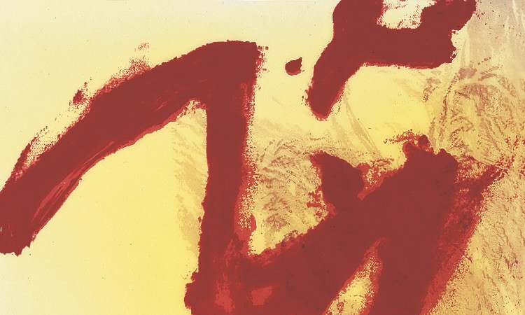
Malfi
1998
From Sequences
Three silkscreens, printed in five to seven colors on primed Rising museum board, each handworked with monotype and poured resin. Each print 50 x 40 cm (19¾ x 15¾ in), each signed and numbered. Edition of 60 + X.
Julian Schnabel’s edition Malfi is composed of three silkscreen prints; each uniquely finished with monotype and poured resin. The works are derived from Schnabel’s larger series The Conversation of St. Paolo Malfi, a visceral tribute to the artist’s late friend and former studio assistant, Paolo Malfi, who died in a car accident near Rome in 1995. Layering vibrant yellow grounds with sweeping red gestures and raw textures, this edition captures the emotional turbulence of grief. With their expressive physicality and radiant surfaces, the silkscreens exemplify Schnabel’s ability to fuse painting, printmaking, and sculpture into a deeply personal and spiritually charged visual language.
Set EUR 4,000
Price incl. VAT, plus shipping
Dispatch within 2–5 business days

Duchamp Triptych
1998
From Sequences
a, b: Two grano lithographs and c: Silkscreen, all on Rives rag paper. Each print 50 x 40 cm (19¾ x 15¾ in), each signed and numbered on verso. Edition of 60+X.
In this edition, Elaine Sturtevant revisits three of Marcel Duchamp’s most iconic motifs: the bicycle wheel, the urinal (Fountain), and the optical spirals. True to her conceptual method developed since the mid-1960s, Sturtevant does not merely copy these images but strategically re-creates them, stripping away the aura of the original and the dominance of the artist’s signature. Rather than positioning imitation in opposition to originality, the triptych collapses that binary, exposing the mechanics of authorship and the circulation of images in art history. By re-performing Duchamp’s provocations, Sturtevant reveals the underlying structures of artistic identity and meaning. Her repetitions do not reproduce Duchamp – they expose Duchamp-as-phenomenon, allowing the viewer to engage with the work beyond the myth of the artist-genius. In this sense, Duchamp Triptych becomes less homage and more analytical lens, through which the viewer confronts the conditions that define and sustain “the work of art” itself.
price on request

Falling Blue, Rising Red
1998
From Sequences
Two heliogravures on Rives rag paper. Each print 50 x 40 cm (19¾ x 15¾ in), each signed and numbered. Edition of 60+X.
With her Falling Blue, Rising Red edition, Rosemarie Trockel returns to the medium that first brought her international acclaim: the knitted image. Drawing on her signature practice of outsourcing the manual labor to knitting machines, Trockel transforms textile patterns into conceptual artworks. Though they resemble simple fabric swatches, her works are layered with cultural and political meaning. Trockel’s knitting works often reference domesticity and traditional gender roles, themes that are subtly evoked here through the use of color. By juxtaposing blue and red – evocative of the pink-blue coding in baby clothes – she reflects on the early social conditioning of gender identity. The precision of the machine-knit structure contrasts with the fluidity of interpretation, inviting the viewer to question the norms embedded in everyday materials. Through this edition, Trockel continues to challenge the sociopolitical positioning of women in art and society, and reclaims textile work as a site of critical inquiry.
Set EUR 3,000
Price incl. VAT, plus shipping
Dispatch within 2–5 business days

Homesick as a Nail
1998
From Sequences
One drypoint etching on Somerset White Rag paper and one silkscreen, printed in five colors on acetate on both sides, hand-colored additions. The two sheets can be viewed separately or overlapping. Each print 40 x 50 cm (15¾ x 19¾ in), set signed and numbered on etching. Edition of 60+X.
Tuttle's work is composed of fragile beauty assembled and transformed from the experience of everyday life. Always experimenting, in these prints, Tuttle manipulated the process of silkscreen by using guided blasts of water directly on the screen to form the imagery of the mylar overlay. As with his works in general, Tuttle continues to investigate the perceptive and cognitive boundaries of the visual field.
EUR 1,500
Price incl. VAT, plus shipping
Dispatch within 2–5 business days

Two works by Sherrie Levine
1998
From Sequences
Two grano lithographs on Fabriano rag paper. Each print 50 x 40 cm (19¾ x 15¾ in), each signed and numbered. Edition of 60+X.
Published as part of the group portfolio Sequences, this edition is based on photographs James Welling had taken of Sherrie Levine’s cast glass sculptures Black and White Bottles, 1992.
Set EUR 1,500
Price incl. VAT, plus shipping
Dispatch within 2–5 business days