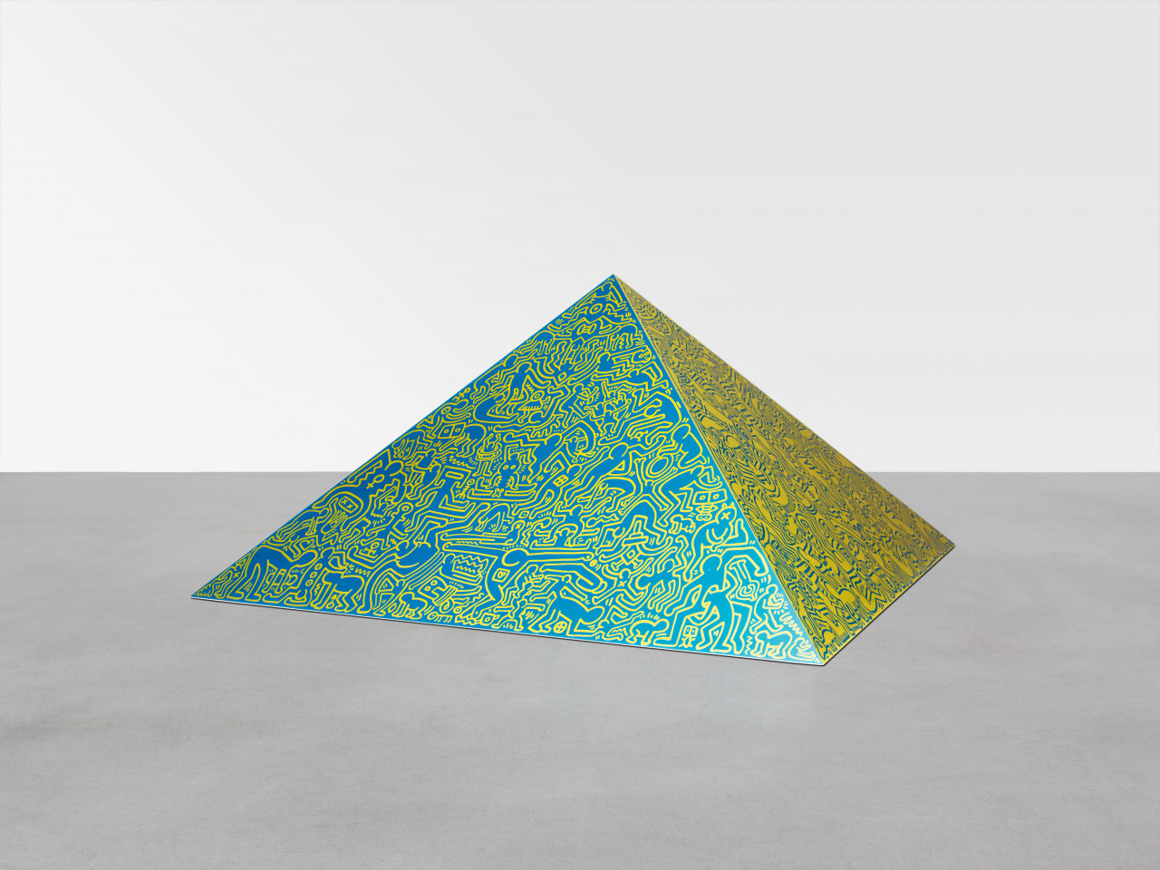
55 YEARS OF SCHELLMANN ART
To celebrate 55 years since the founding of Schellmann Art (formerly known as Edition Schellmann), we take you through seminal collaborations with artists including Andy Warhol, Joseph Beuys, Christo & Jeanne-Claude, Keith Haring, Donald Judd, and Thomas Ruff, our cooperation with Documenta and Venice Biennale for whom Schellmann published the official editions in the late 1990s and early 2000s, and the many boundary-pushing edition projects Jörg Schellmann has brought to life.
Jump to chapters: Andy Warhol | Joseph Beuys | Christo & Jeanne-Claude | Keith Haring | Donald Judd | Thomas Ruff | Dan Flavin | Peter Halley | Nam June Paik | Liam Gillick | Bernd & Hilla Becher | Jeff Koons | Daniel Buren | Joseph Kosuth | Documenta & Biennale Venice | Wall Works | Pushing the Limits of Editions
ANDY WARHOL
Jörg Schellmann: “In 1968, when I was still in law school, I travelled to New York with a friend and managed to find someone who could give me the address of Andy Warhol’s Factory at 33 Union Square. There was no sign for "Warhol" to be found but the upper signs of the elevator buttons were empty, so I figured that could be the studio. Upon arriving at the top, the two wings of the elevator door opened and revealed an empty room with a black-painted floor and three heavy desks, covered in mirrors. At each of the three desks lounged a handsome young man on the phone. They took notice of me only with a delay. I shyly asked to speak to Andy Warhol, to which one of the young men loudly called: "Andy, there is somebody for you." Andy appeared without any fuss and quietly greeted me with "Hi, I’m Andy." I introduced myself and asked to do a print with him, which he didn’t seem very interested in. Instead, he asked “Why don’t you do some dirty movies with me?” I had no idea what that meant or how to respond, so eventually we agreed that maybe we could do something at a later time.
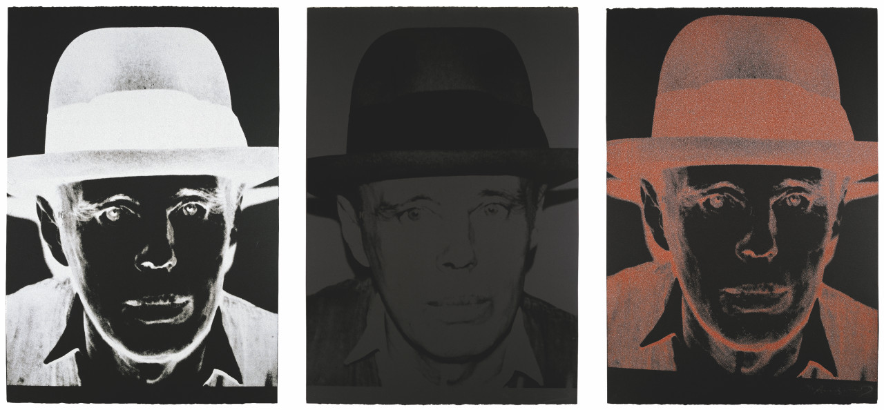
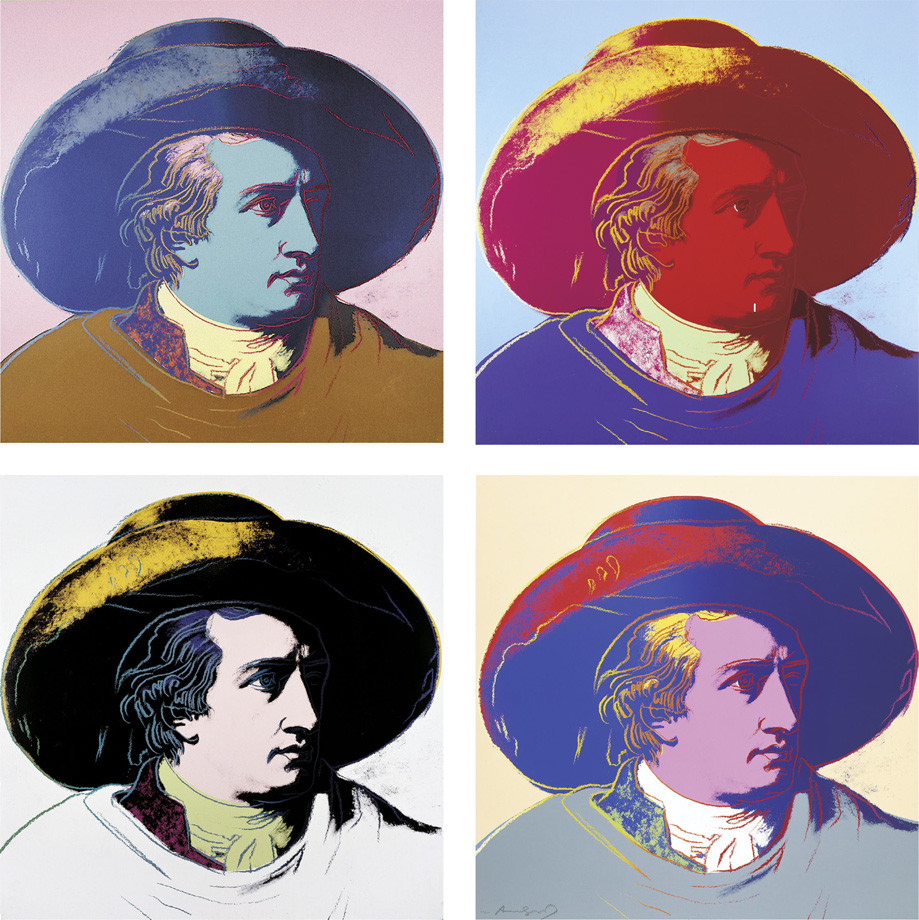
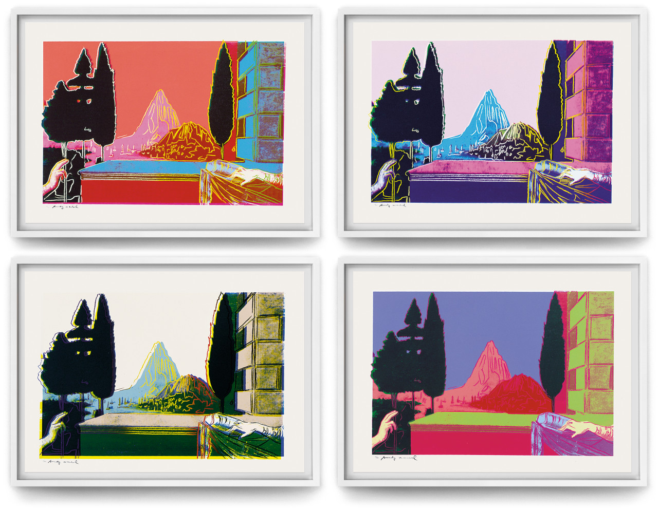
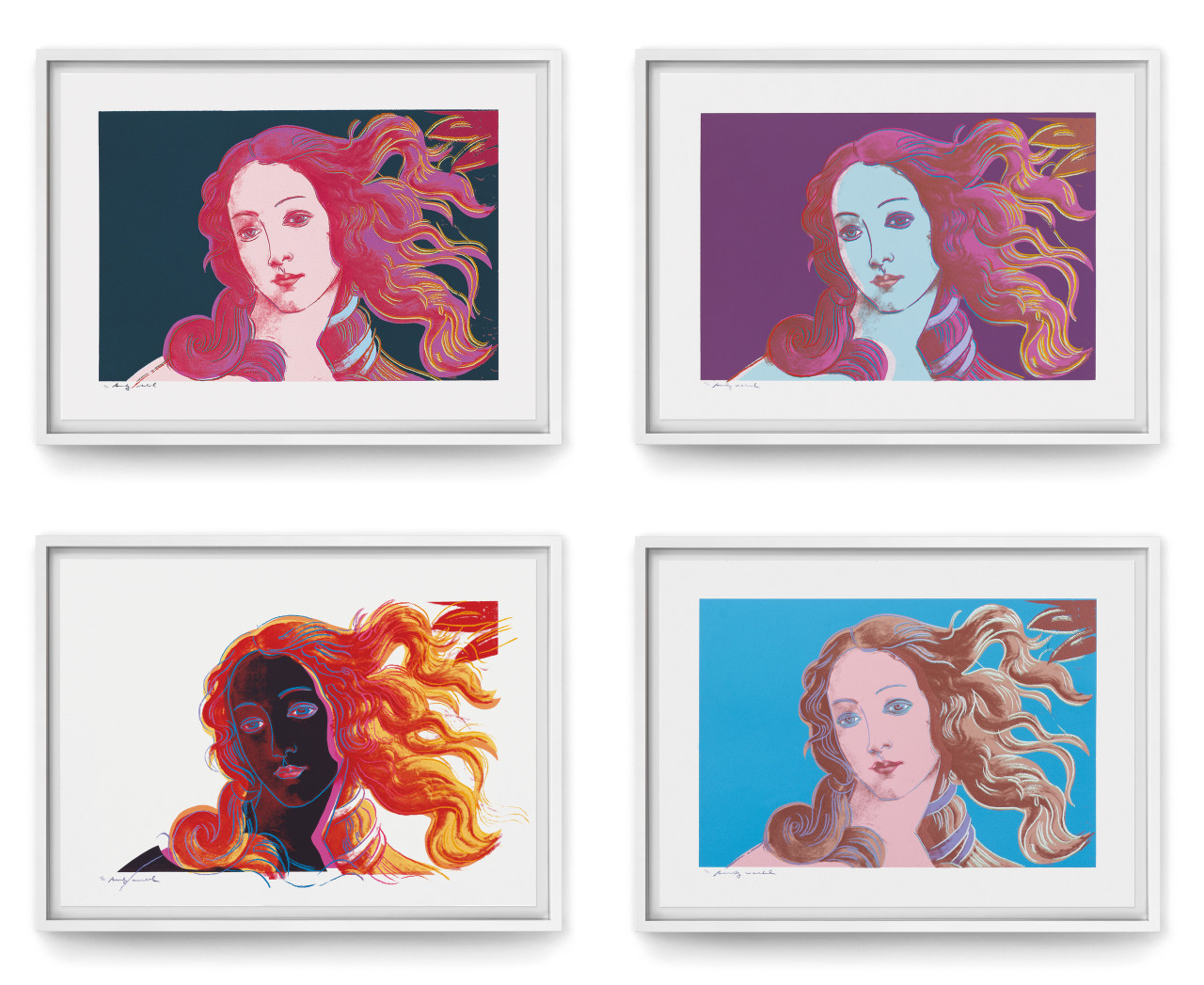
We met a few more times and finally started to actually work together: after a meeting between Joseph Beuys and Andy Warhol, we published Andy's portraits of Beuys (Joseph Beuys, 1980-83). Later followed Goethe, 1982, Details of Renaissance Paintings, 1984, Neuschwanstein, 1987, etc. In 1985, together with Frayda Feldman, we also published the catalogue raisonné of Andy's prints, which is currently in its fourth edition."
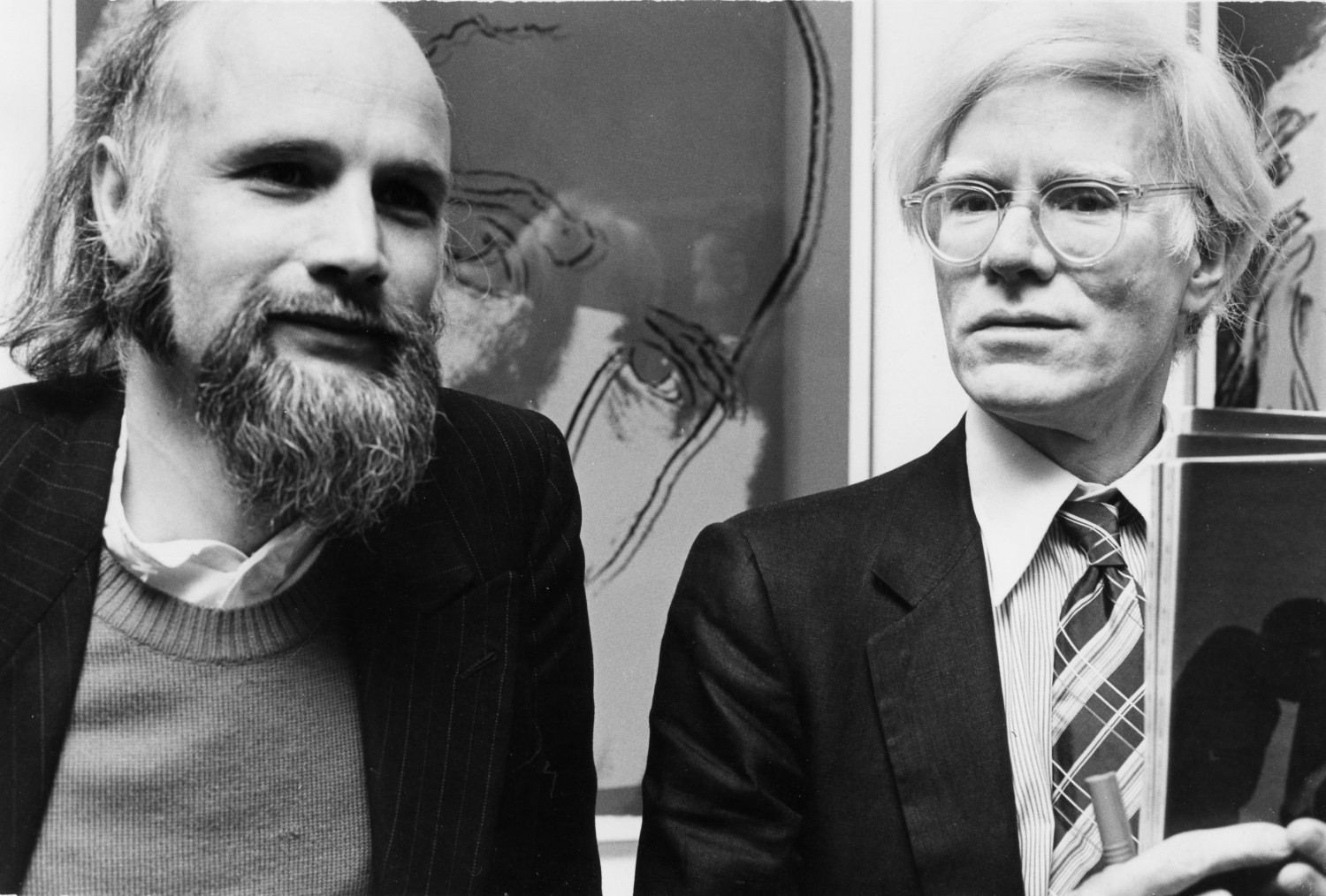
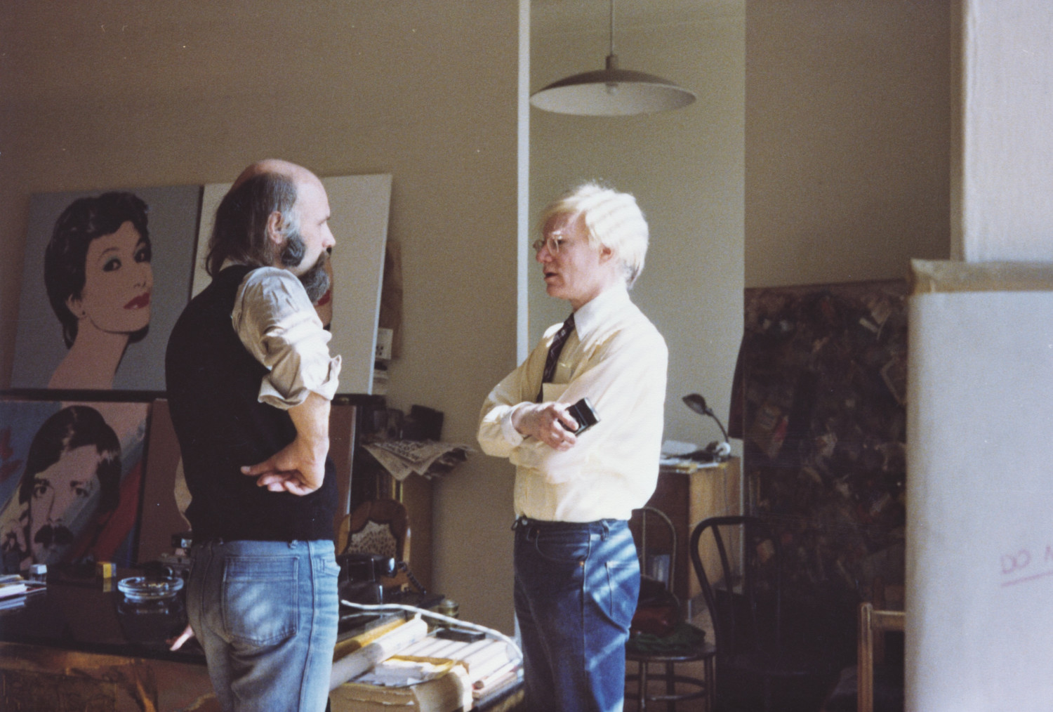
Image 1: Jörg Schellmann and Andy Warhol at Galerie Schellmann & Klüser, Munich, in 1980 © Andy Warhol Foundation © Schellmann Art | Image 2: Jörg Schellmann and Andy Warhol at Warhol’s studio, New York, 1983
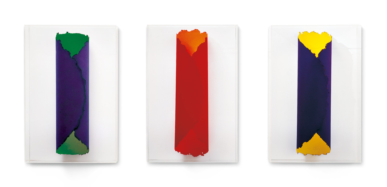
Portfolio of three screenprints on Arches Black, prints a (F&S II.245) and c (F&S II.247) with diamond dust, each 112 x 76 cm. Edition: 90 + 15 AP, signed and numbered.
F&S II.245-247
Portfolio of four screenprints on Lenox Museum board, 96.5 x 96.5 cm. Edition: 100, each signed and numbered.
F&S II.270-273
JOSEPH BEUYS
JS: “In the late 1960s, when the art world and I were fascinated by Pop Art and the new images coming in from London and New York, there was this German artist both galleries and collectors were talking about: Joseph Beuys, a man who drew deer and mountains and used basic materials like felt, fat and copper. This was in complete contrast to the striking world of industrial signs and consumer products the Pop artists were celebrating. But in 1970, Bernd Klüser, my gallery partner at the time, and I decided to visit Beuys and convince him to let us do a show of the roughly thirty multiples that he had realised by that time. This visit resulted in not just a show, but also the first catalogue raisonné of these works and our very first edition with him. It was the beginning of a long collaboration, which had a profound impact on me, both personally and professionally.”
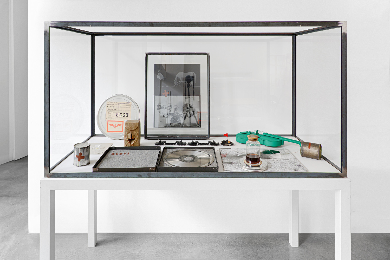
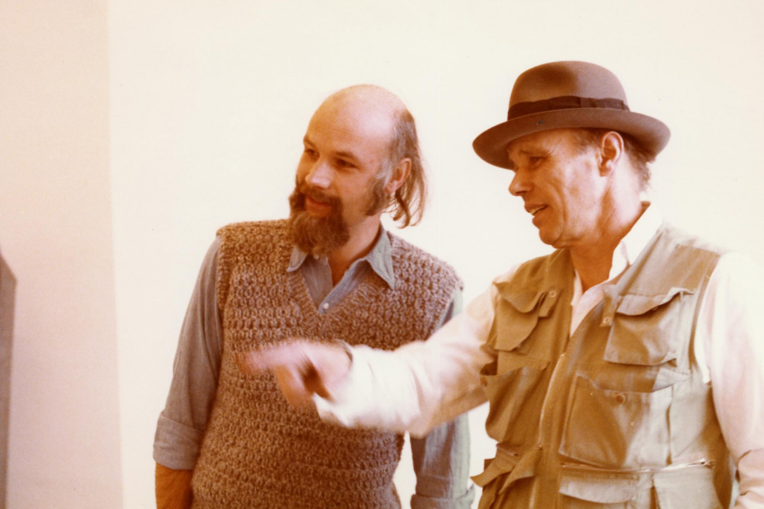
Image 1: Vitrine with various multiples by Joseph Beuys, all published by Schellmann Art | Image 2: Jörg Schellmann and Joseph Beuys preparing the Zeige deine Wunde exhibition in Munich, 1976 © Joseph Beuys Estate © Schellmann Art
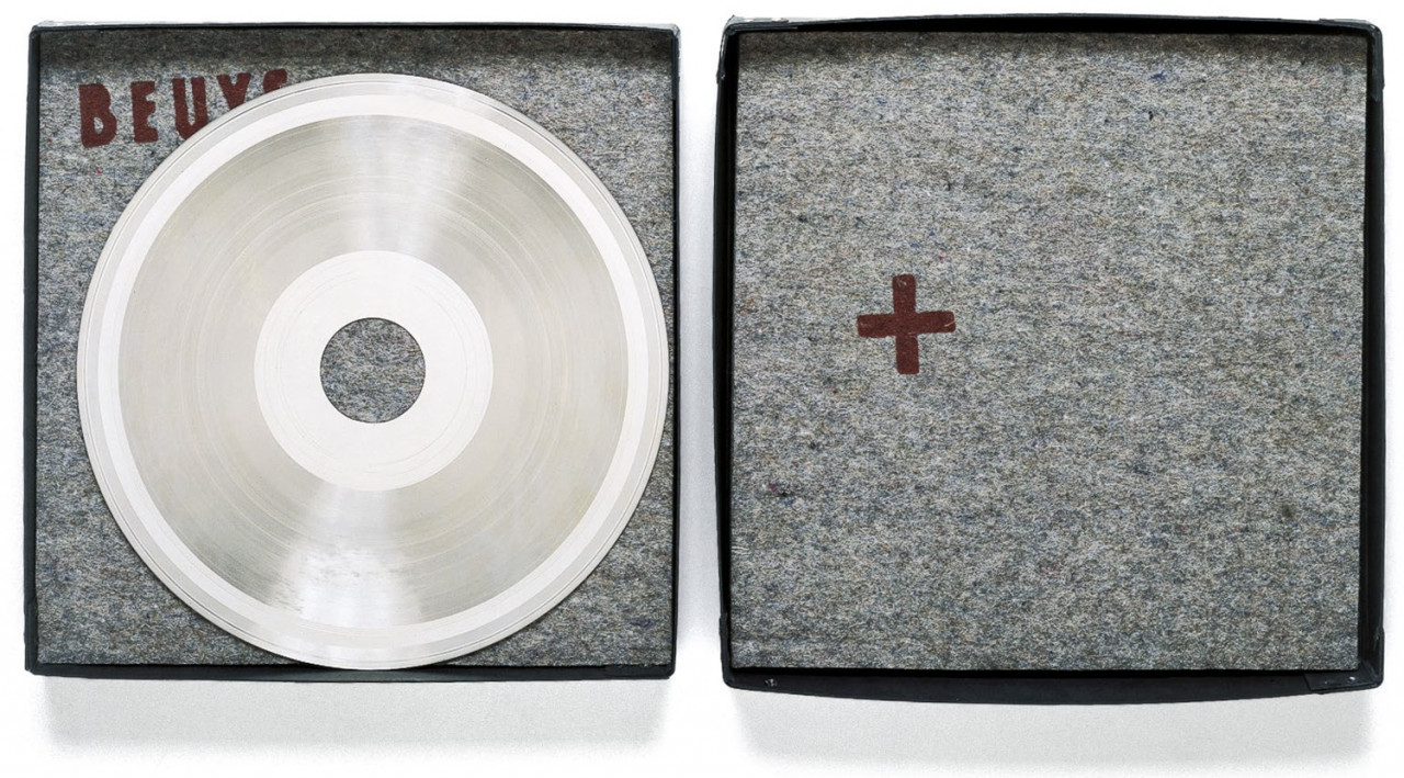
Record master-mould (copper, nickel plated on incised side) with hole punched in the center, and two pieces of felt, each stamped with brown paint, in black cardboard box with label, 38 x 38 x 4 cm (15 x 15 x 1½ in). Edition: 77 (+ VII + 3 H.C.), signed and numbered on label on the box.
Schellmann 85
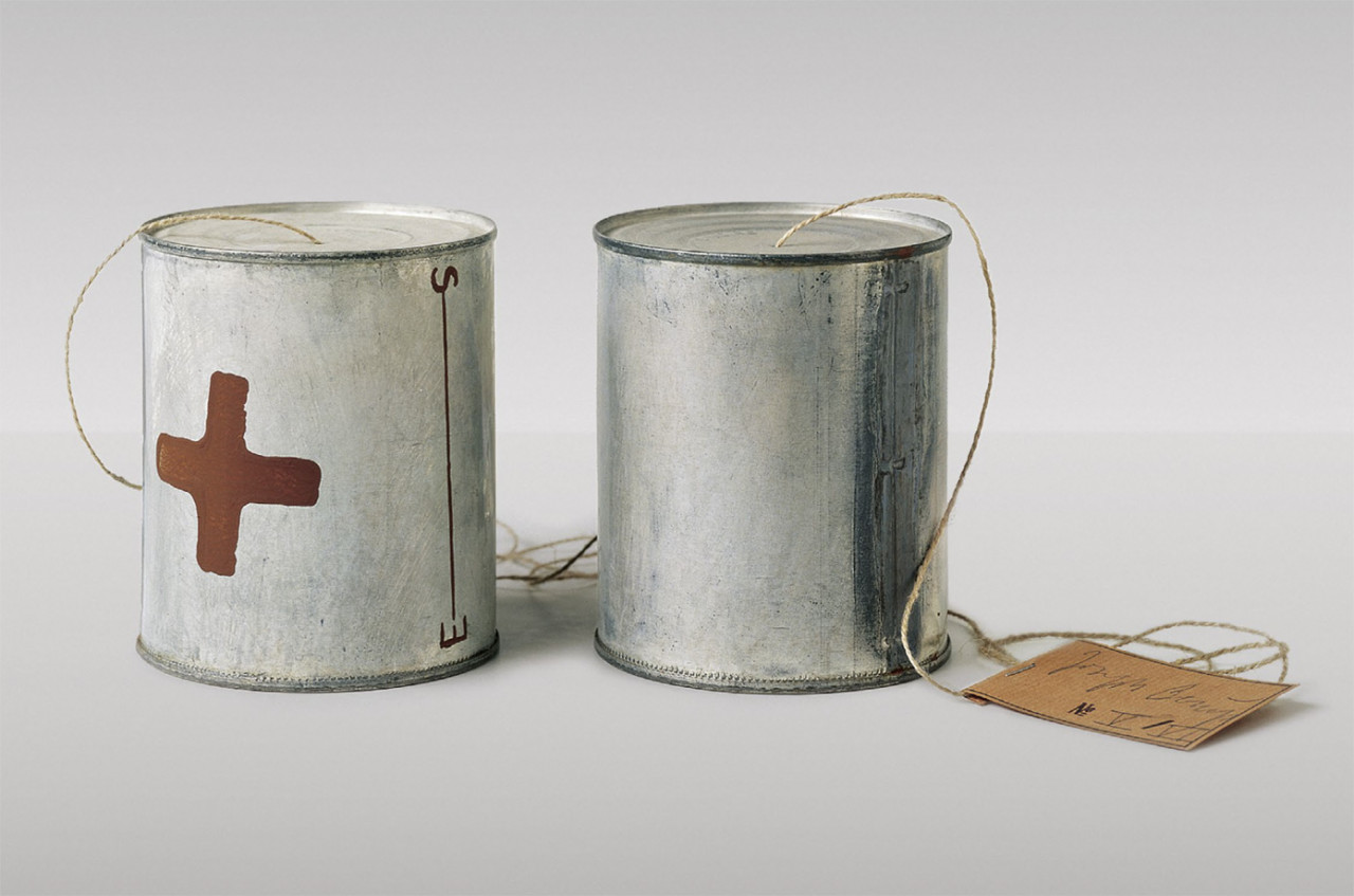
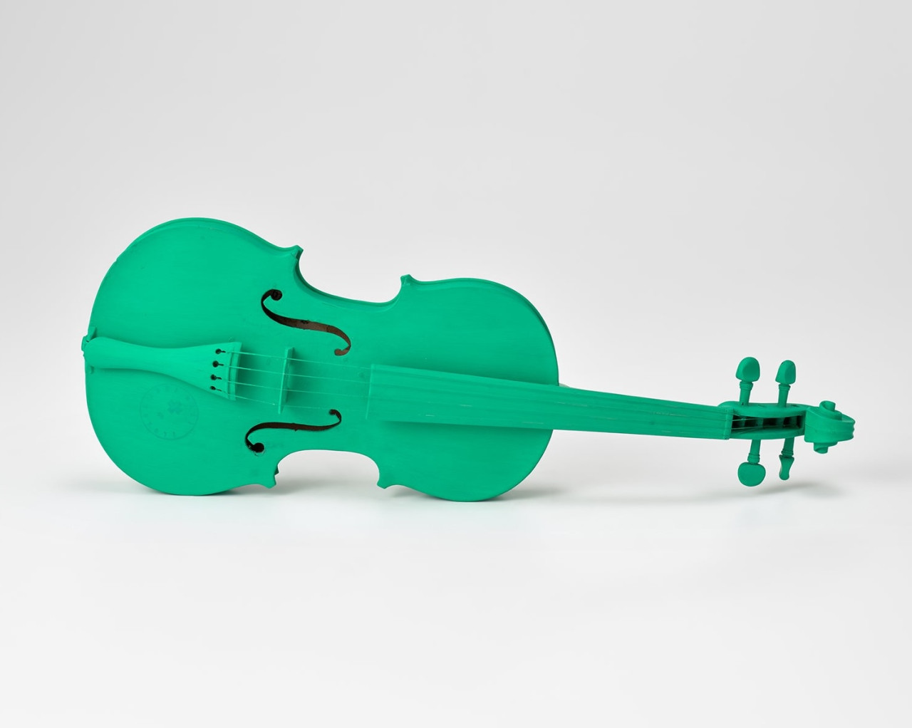
Part of Two Fluxus Objects (together with Green Violin)
Two tin cans, one with symbols in brown paint (Braunkreuz), 180 cm string, and paper tag. 204 x 10 x 10 cm. Edition: 24 + VI (6 with brown painted symbol also on second can), all signed and numbered on paper tag. 5 A.P., signed, not numbered.
Schellmann 136
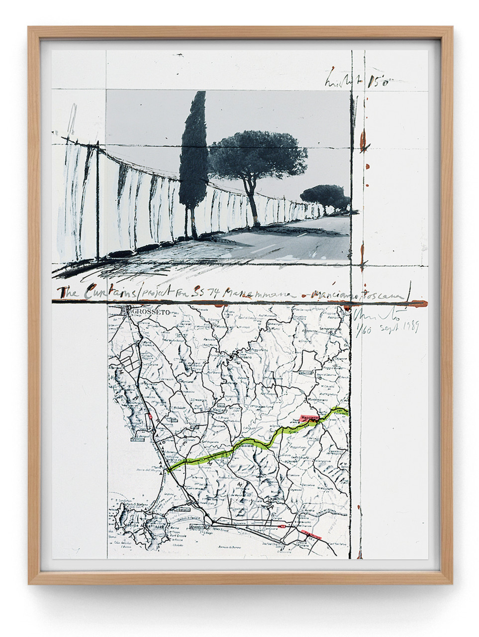
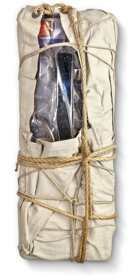
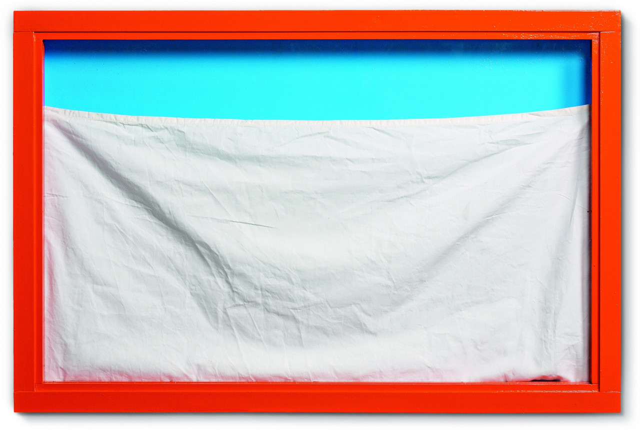
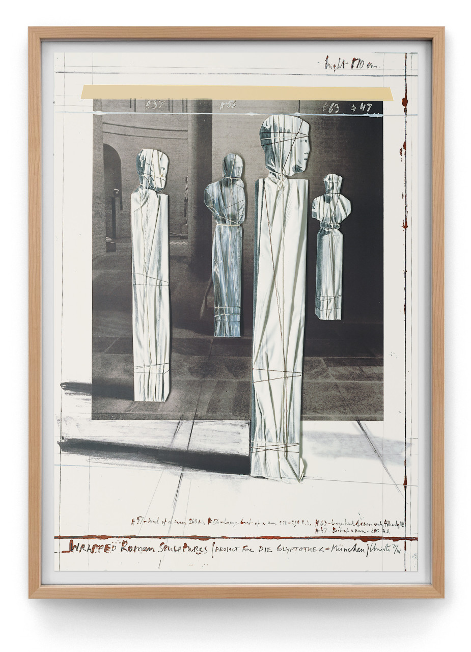
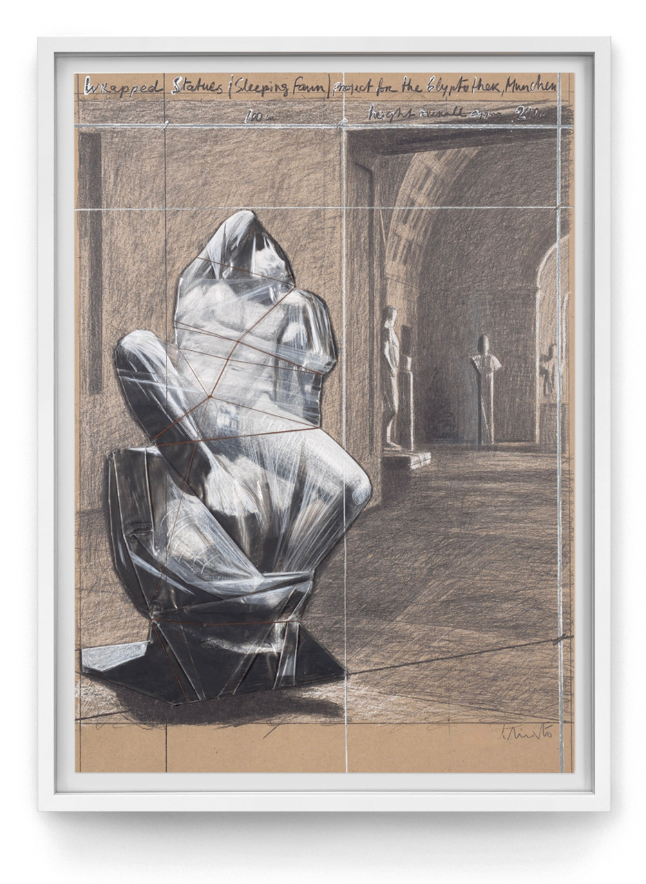
CHRISTO & JEANNE-CLAUDE
JS: “Working with Christo has always been particularly easy and pleasant as he and Jeanne-Claude were so generous and kind. And since the two introduced me to my now ex-wife Joséphine at their Pont Neuf Project in 1985 and affectionately called our two children “children of the Pont Neuf”, the relationship became exceptionally personal and meaningful. Whenever I was in New York, visiting Christo and Jeanne-Claude was one of my highlights.
Joséphine and I later edited their first edition catalogue raisonné and I worked with them on numerous projects – from Wrapped Coast, Little Bay, Australia, 1969 in 1975 over Wrapped Payphone, 1988 to Show Window, 2013 and Wrapped Chair, Project, 1963 in 2019. When they died in 2009 and 2020, respectively, I lost two wonderful friends.”
Christo and Jörg Schellmann in the artist's studio with a variant of Wrapped Payphone, 1988, in New York © Christo and Jeanne-Claude © Schellmann Art
Enamel painted wooden frame, with fabric, 61 x 92 x 7.5 cm (24 x 36¼ x 3 in). Edition of 35, signed and numbered on label.
EUR 12,000
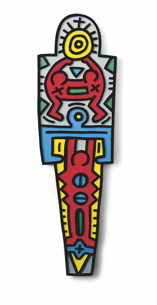
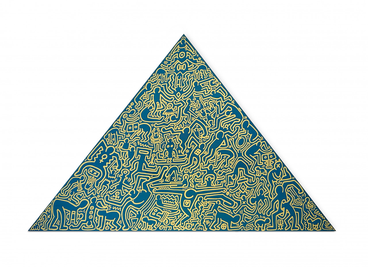
KEITH HARING
JS: “When I first approached Keith in 1985, he happily agreed to do an edition with a simple ‘cool’. After a few months, he invited me to his studio to see his finished designs. As I approached the building on the corner of Broadway and West Houston Street, loud music was blaring from the open windows of the 2nd or 3rd floor. I instantly thought that could be the studio. In any case, the cool music and the fact that I was about to visit Keith Haring instantly made me feel like I had fully arrived in the hip New York of the 80s. Of course, the music did indeed come from Keith’s studio. As I entered the studio, whose door was slightly ajar, the music swelled to disco volume and I could see a room filled with hundreds of drawings on the floor, a boom box in the middle of the room, and Keith at the back by the window. As if we were old friends, Keith signalled that I could pick something from this abundance of drawings. It took me a moment to take it all in. Then I carefully balanced on the gaps between the drawings to see everything while Keith let me roam around and gave only a few comments. I ended up choosing two series of three drawings each that I took with me proudly, without a receipt, without any financial arrangements, just like that. Incredibly cool. When the prints were printed, I boldly asked Keith to do an exhibition with us in Munich to which he agreed. As soon as he arrived at the gallery in Munich, he started painting on the walls – accompanied by the sounds from his boom box.”
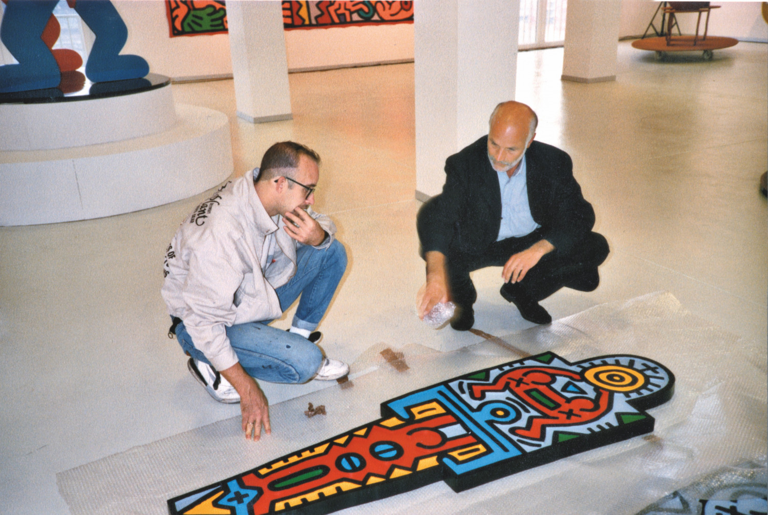
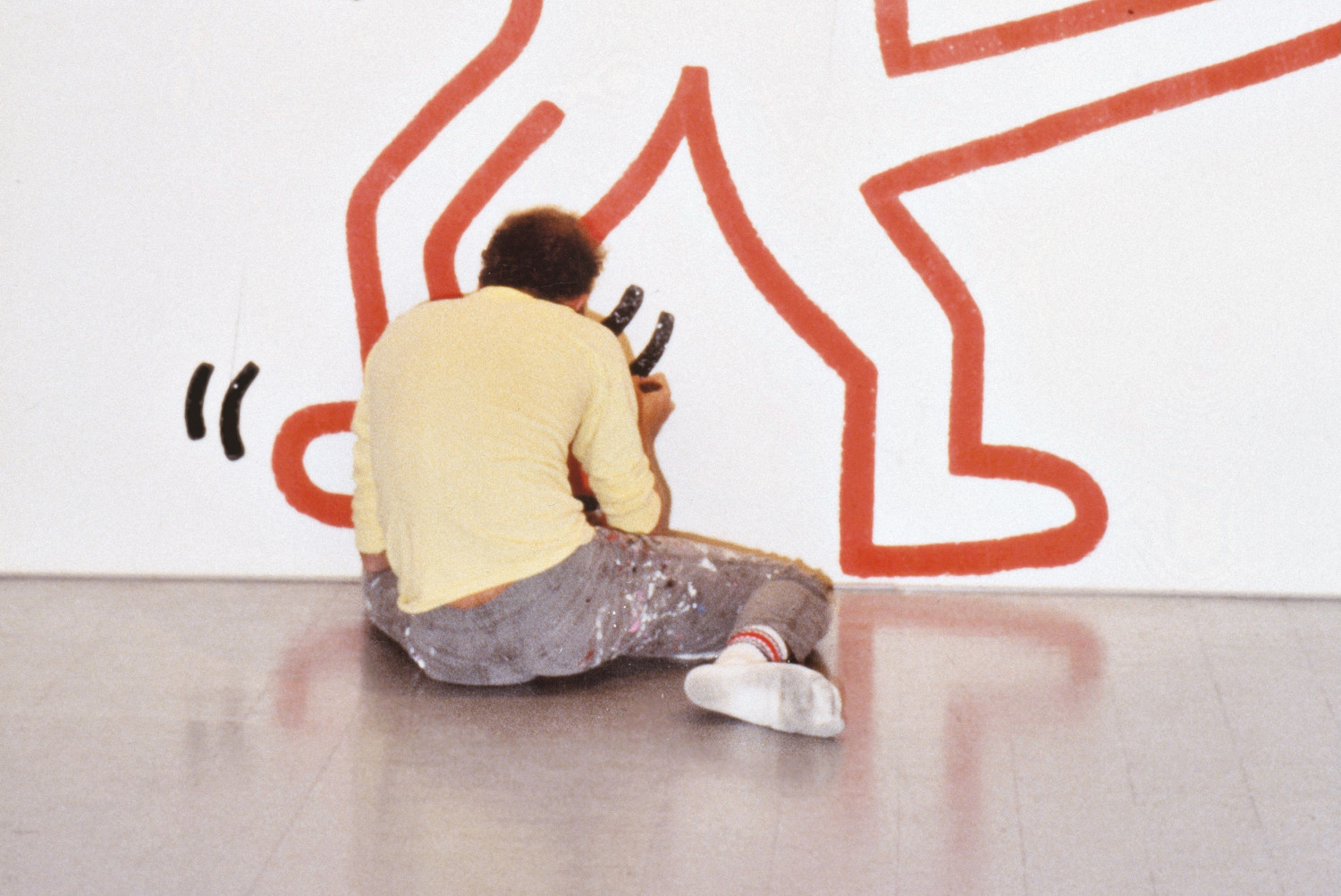
Image 1: Keith Haring and Jörg Schellmann inspecting a proof for Totem at Hans Mayer Gallery, Dusseldorf, in 1987. Photo: Joséphine Benecke © Keith Haring Foundation © Schellmann Art | Image 2: Keith Haring working on a wall drawing for an exhibition at Edition Schellmann, Munich, in 1985. Photo: Peter Stephan © Keith Haring Foundation © Schellmann Art
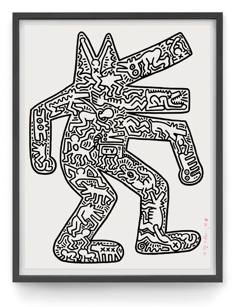
Four different anodized aluminum plates, 104 x 144 x 3 cm each (41 x 56½ x 1 in). Edition of 30, signature and number etched on verso.
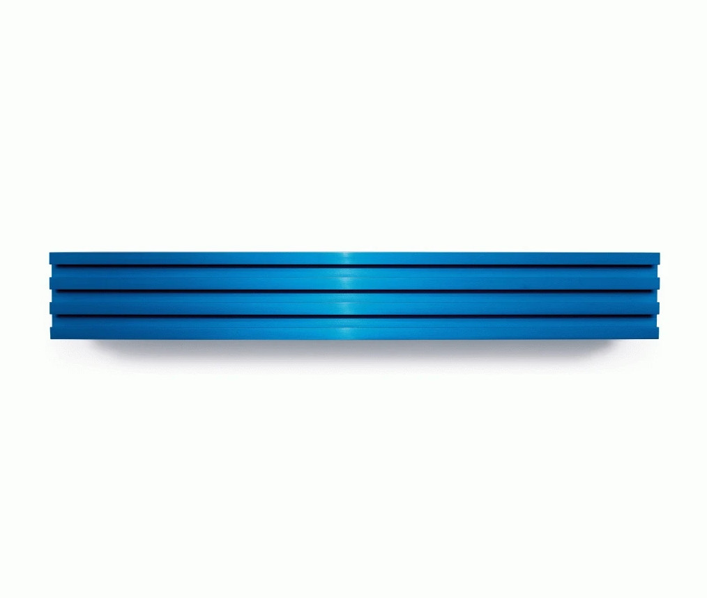
DONALD JUDD
JS: "After becoming a little frustrated that Don had not responded to some projects that I had suggested to him in 1989 and 1990, I changed tactics and asked him if there was anything that he was interested in doing. Unexpectedly, his face lit up, and he said: “There is something, an object that is simple to make, all made out of one piece with no welding or screwing but pretty expensive to do as it requires the production of an industrial tool”. In order not to miss out on an opportunity, I immediately said I was ready to bear the costs. Don explained that the factory in Switzerland needed to produce a minimum 200 metres of the unique aluminium profile that Don had in mind. He made a little sketch of the design on a restaurant receipt, and I was immediately thrilled by the concept. The portcullis-like cross-sectional profile of this multiple does not appear in any other edition by Don, and is realised in twelve different anodized colours, each in an edition of twelve. However, Don did reserve the right to use a few of the anodized pieces, several metres long each, for separate one-off works. When it came to the actual production at Alu Menziken, I asked Don to determine the colours. Don said: “that’s a business aspect of the pieces, so you choose the colours.” I was thrilled to do so although the colour chart proved to be pretty limited and mainly contained the spectrum of industrial anodizing tones. When the pieces were released in 1991, sales were pretty poor and I asked Don if we could lower the price a bit or offer better discounts to dealers. He rejected the suggestion, so it took a few years until suddenly there was a great demand and prices went up. Looking back on the pieces – Untitled (Aluminum), 1991 – today, I feel it is one of the most significant editions I have produced within my 55 years of publishing."
Extruded aluminum, anodized in 12 different colors, 15 x 105 x 15 cm (6¼ x 41 x 6¼ in), edition of 12 each color.
Set of 4 woodcuts on Japanese paper, with a hand-painted oil paint stripe on the glass of the galvanized iron frame, each 61 x 81 x 2.5 cm (24 x 32 x 1 in), estate stamped. Edition of 25.
THOMAS RUFF
JS: "In 1986, I saw three small photos in a group show of a public space. The photos showed interiors of lower middle class German apartments taken in an emphatic documentary and minimal manner, with no whiff of arrogance, lending dignity to these generic bourgeois interiors. I decided to contact the artist behind these photos. Some months went by without communication until I saw Thomas Ruff’s large-scale portraits at the Kunstverein, Munich. Now it was clear, I had to see this artist. I met Thomas in his little studio compartment in a municipal industrial building that he was sharing with a number of other artists at the time, which he now owns. We started working on editions together and have now been doing so for 35 years; always with the understanding that Schellmann Art publishes a set of prints for each subject or theme the artist explores – a wonderful working relationship realising over 150 works since 1988."
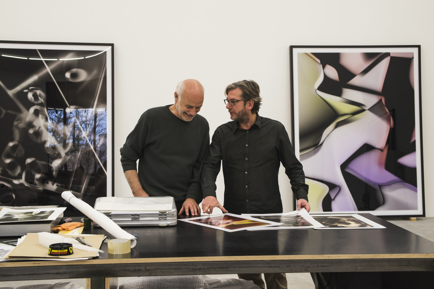
Jörg Schellmann and Thomas Ruff in his studio, Dusseldorf, 2014 © Thomas Ruff © Schellmann Art
Four digital archival pigment prints on Hahnemühle Photo Rag Ultrasmooth 305g/qm paper. Vertical works (d.o.pe. 03 III, d.o.pe. 04 I, and d.o.pe. 03 I): 70 x 55 cm (27.5 x 21.7 in); horizontal work (d.o.pe. 11 I): 70 x 100 cm (27.5 x 39.5 in). Edition of 40 + 5 AP, signed and numbered.
Co-published by Schellmann Art and Utopia Editions.
Set EUR 9,000
Vertical works EUR 2,200 each
Horizontal work EUR 3,300
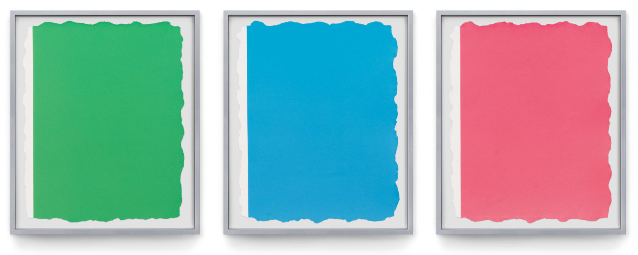
Portfolio of six C-prints, each 84 x 60 cm (33 x 23¾ in). Edition of 40, each signed and numbered.
DAN FLAVIN
JS: “When I first approached Dan for an edition in 1991, I was disappointed that he wanted to do something on paper instead of a light work. But I figured, I had to do it if I ever wanted to work with him again. The coloured paper rolls we ended up doing (Untitled, 1994) were rather beautiful and became fast sellers. And I was right, several more edition collaborations followed, including some of his iconic light works. Untitled (to Jörg Schellmann) is still one of the most beautiful and treasured editions I have published.”
Suite of three aquatints printed on both sides of handmade Twinrocker paper, each 71 x 20 cm (28 x 7.8 in), rolled, mounted in plexiglass box, 82 x 54 x 23.5 cm (32 x 21½ x 9¼ in). Edition: 15, signed and numbered on inside of tube.
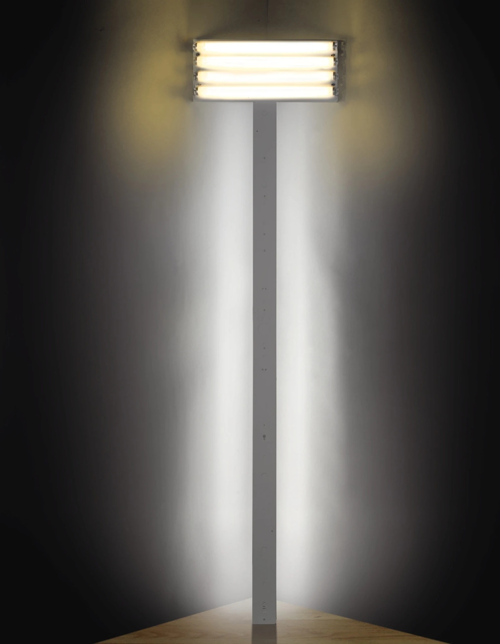
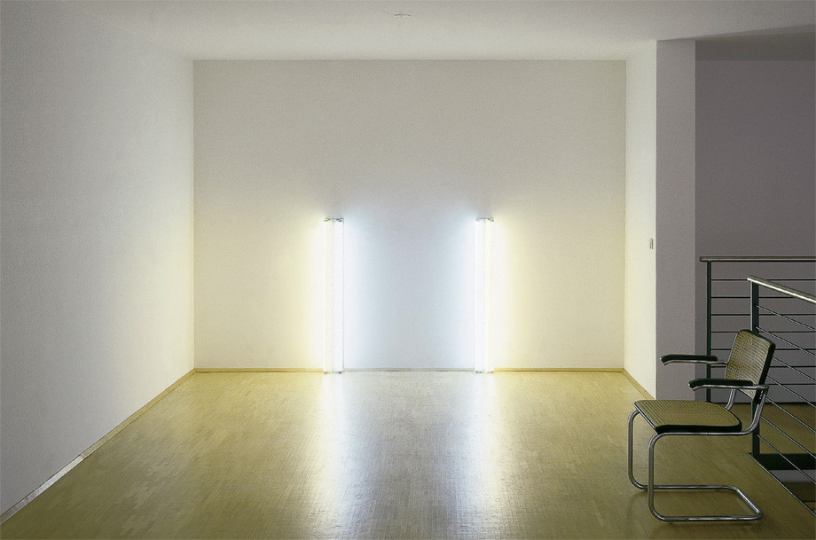
Daylight and warm white fluorescent light, 234 x 61 x 20 cm (92 x 24 x 8 in), edition of 5 (only 3 made), signed and numbered on certificate.
From Sequences
Three aquatints printed from two to three plates each on Twinrocker handmade rag paper. Each print 50 x 40 cm (19¾ x 15¾ in). Edition of 60+X, each print numbered and estate signed by the artist's son, Stephen Flavin on verso.
Set EUR 2,700
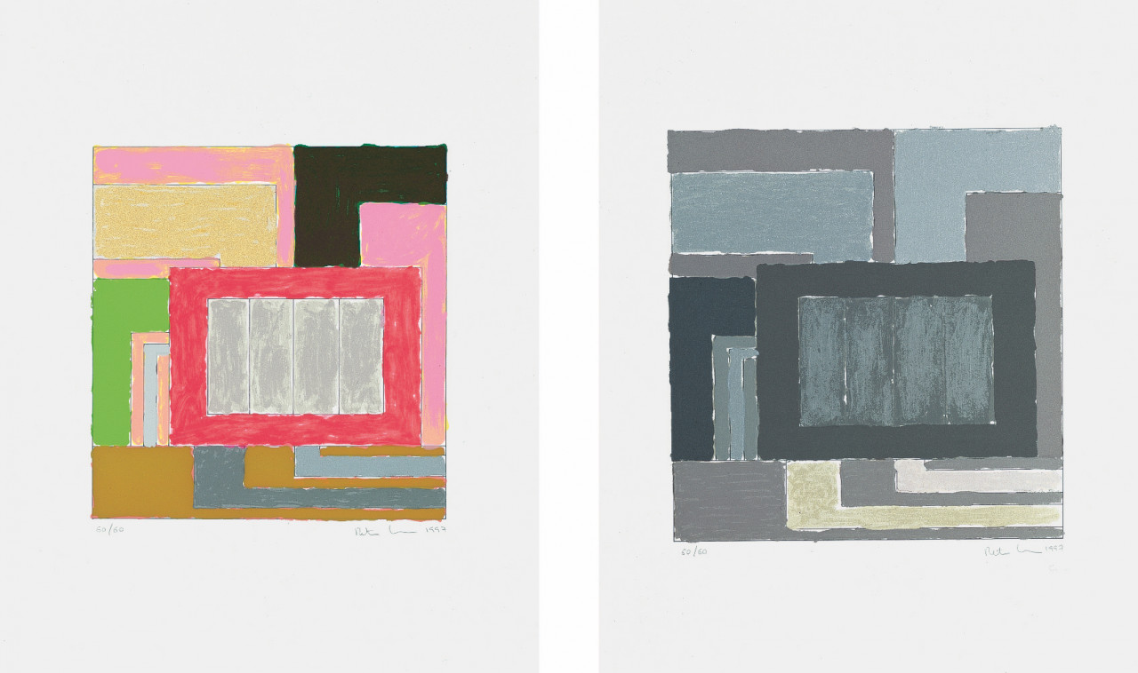
PETER HALLEY
JS: “In the 80s, Metro Pictures was one of the most influential galleries and I had worked with a number of their artists, including Cindy Sherman and Robert Longo. So, when they suggested I reach out to Peter Halley, I didn’t hesitate. Since then, we have worked on multiple prints, objects and wall works together and developed a kind of friendship.
Our most recent edition with Peter was inspired by his Heterotopia show at the Venice Biennale 2019. He had covered the walls of one of Venice’s historic salt warehouses with yellow paint and hieroglyph-like drawings. It was a stunning installation and truly exceptional experience walking through these halls that resembled Egyptian tombs. Because it was rather complicated to achieve technically, the edition took 4 years to make but eventually we had our miniature version of Peter’s show: Glossary, 2023.”
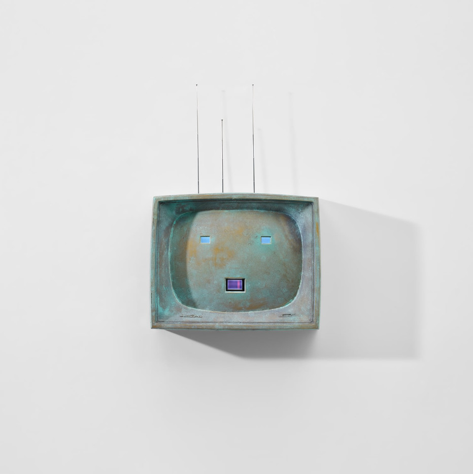
NAM JUNE PAIK
JS: “Paik, who like Beuys, was among the early Fluxus circle, was a natural candidate for our portfolio for Joseph Beuys. It was our first collaboration, and I was eager to work with him again. Of course, I was interested in his TV works and luckily, they were to follow soon. A self-portrait in bronze inside a TV set from the 60s, a bronze with 3 small built-in TV sets, a 40s TV set with an aquarium and goldfish behind the screen, and another with a burning candle as the TV image. That was Paik, the father of video art, at his best. The objects reflected the modern reality of television in wonderful wisdom and tranquility.
Paik would give me the details of an antique TV set he wanted, provide me with some sources and task me with finding them. Each antique dealer had perhaps one or two devices, so we would have to source and purchase the pieces over months until we had enough for the edition. And then of course we had to refurbish these old and sometimes scratched TV sets and gut them if necessary.
Paik was incredibly unpretentious and a joy to be around with his enigmatic, self-ironic sense of humour. While working on Color Bar Theme and Variations, a video he made for us in 1997, he declared ‘I never watch videos.’”
Bronze, patinated, with three TV monitors, antennas, plug, 48 x 59 x 15 cm (19 x 23 x 6 in). Edition of 24, signed and numbered on label.
From Sequences
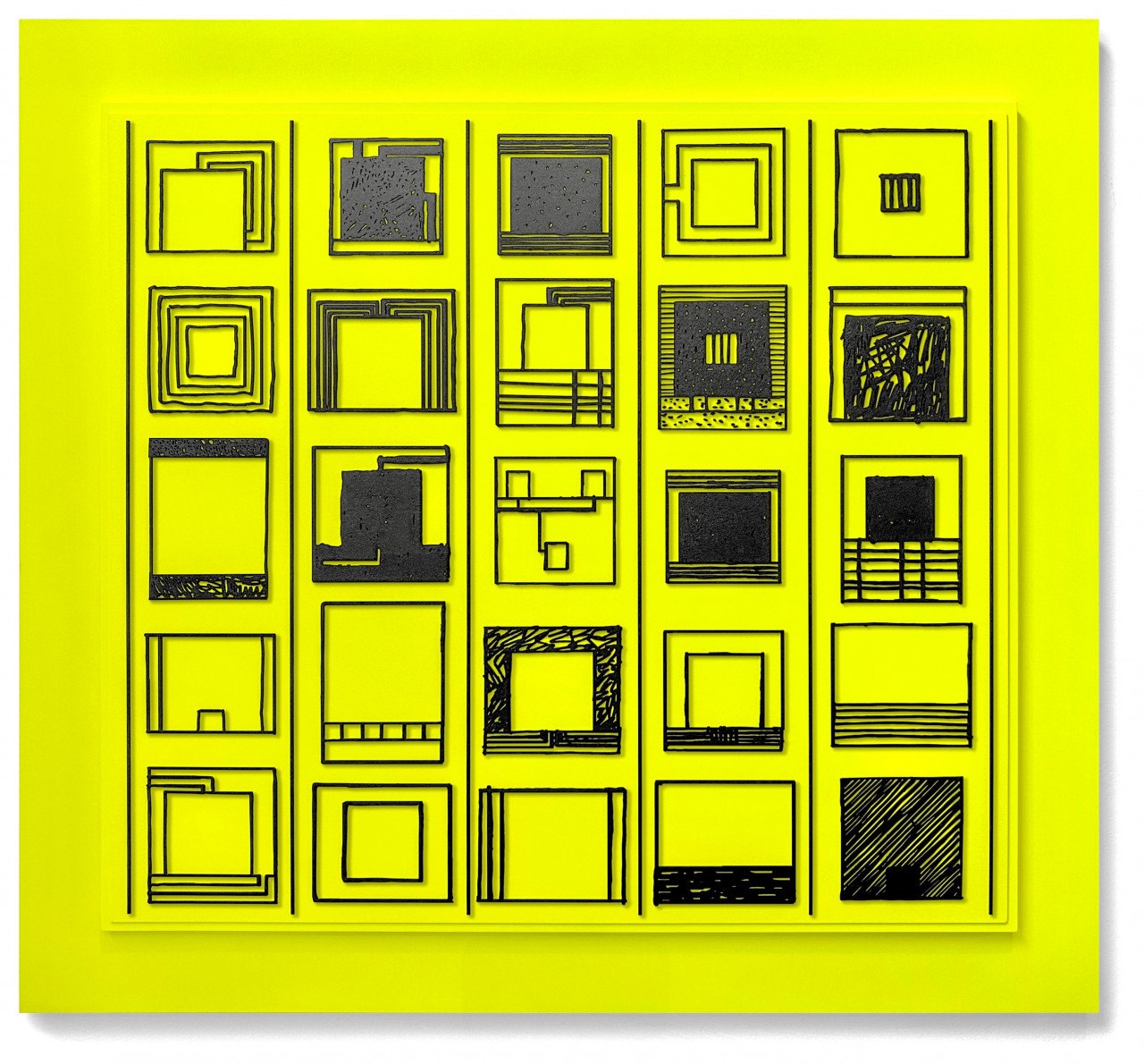
Three mixed media prints (silkscreen and offset), two of them (A and C) with collage, all on Rives rag paper. Each print 40 x 50 cm (15¾ x 19¾ in), each signed and numbered. Edition of 60+X.
Set EUR 2,500
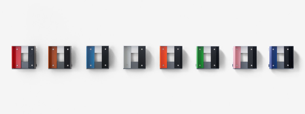
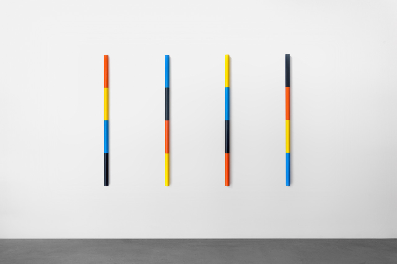
LIAM GILLICK
JS: “Liam and I started working together when he participated in Door Cycle and immediately hit it off. We speak the same formal language and appreciate each other’s advice and take on things. Our latest collaborations, Equal Quarters and Replicated Revision, both 2022, are exceptionally beautiful wall pieces.”
Powder-coated aluminum piece, in 8 color variations, 16 x 15 x 7.5 cm. Edition of 12 per color, signed and numbered on label verso
Color variations: RAL 3020, RAL 8023, RAL 5012, RAL 7035, RAL 2004, RAL 6018, RAL 3015, RAL 5005
Each EUR 3,000
Set of 8 EUR 20,000
Tubular aluminum in four sections, powder coated, each 140 x 5 cm diameter, each different in color combination. Edition of 10, signed and numbered on separate certificate.
Color variations (in order shown in pictures):
D – color sequence starts with RAL 2004 (pure orange)
B – color sequence starts with RAL 5012 (light blue)
A – color sequence starts with RAL 1021 (rapeseed yellow)
C – color sequence starts with RAL 9005 (jet black)
Each EUR 3,500
Set EUR 12,000
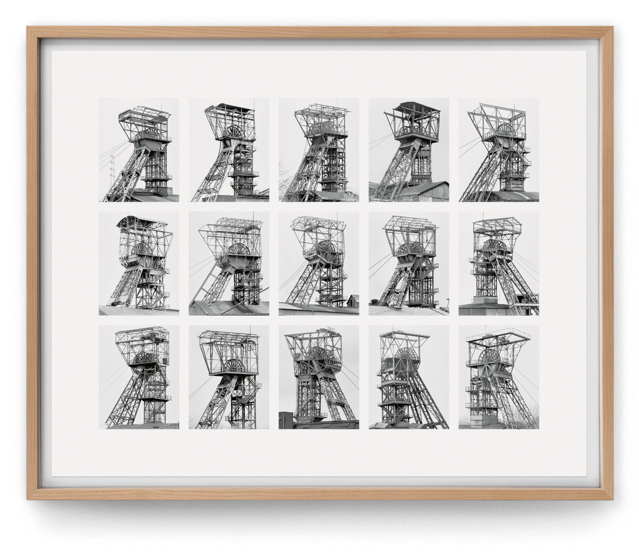
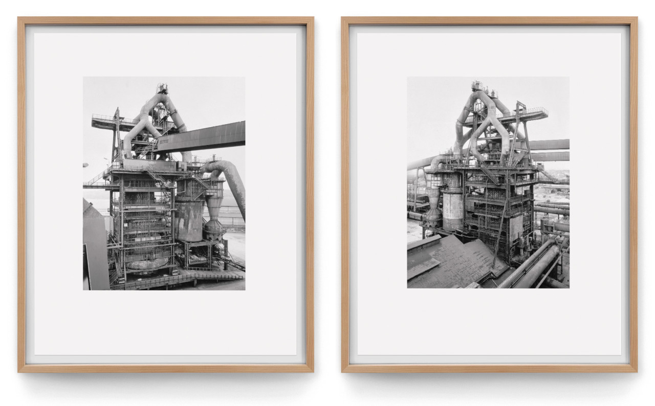
BERND & HILLA BECHER
JS: “A conversation with Lothar Schirmer, the publisher of Bernd & Hilla Becher’s books, sparked the idea to systematically publish several of the artists’ images, mainly of their typological series. The Bechers liked the idea and gave me a small collection of older prints to put together a show in our gallery to start our collaboration. The typologies were then published over the course of several years until Bernd’s death in 2006.”
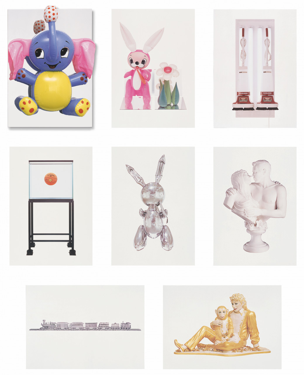
JEFF KOONS
JS: “One of the most tedious tasks of a publisher is to repeatedly reach out to artists, only to receive little to no response. So, I was all the more surprised when Jeff Koons, who had lived in Munich for a while, called one day saying he needed my advice as a publisher. The prints he had produced in recent years were not selling as expected, and he wanted to know what could be done. I suggested that reproductive prints were a problem, and prices were too high. I proposed making a new series of prints together with an object, as these were his strength and his trademark. He thought this was a worthy piece of advice. I offered to do it with him as we had suitable craftsmen at hand for very different techniques. He agreed and we published the portfolio Jeff Koons, 1995, which was encased in a polished stainless-steel casket with a balloon toy mounted on top of it.”
Mirror-polished stainless steel box, 101 x 71 x 5 cm (39¾ x 28 x 2 in), with inflatable plastic elephant, to be hung as wall object, containing 7 offset lithographs, 100 x 70 cm (39½ x 27½ in) each. Each print signed and numbered; box signed and numbered on label. Edition of 50 + 10 A.P.
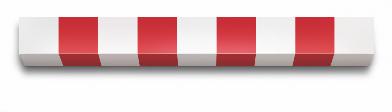
DANIEL BUREN
JS: "I first approached Daniel Buren to invite him to participate in a series of wall objects in 1988. This made sense, as Buren’s works are generally conceived to relate to the wall and space they’re in (i.e. in situ). He proposed three different-sized lightboxes with his trademark stripes in different colors, which were to be installed at equal distances from the floor to the ceiling, depending on the height of the wall. As a conceptual artist, he only developed the principle and left the execution to us and partially even to the owner of a piece. I received a diagram via fax that precisely defined the work. It was a concept determined by the given width of the stripes and the dimensions of the wall. The colours, different for each piece, were then determined together.
Through this first collaboration, I fully realised that it was not merely about stripes, but that the design was the basis for more complex, varied possibilities. Buren wanted to see what could be achieved with inherently non-artistic stripes. Pieces marked by design (by Buren) and execution (by others). Daniel became influential to the way we thought about and produced editions.”
Wood, painted, size 8.7 x 78.3 x 8.7 cm (3¾ x 30¾ x 3¾ in). Stamped and hand numbered by the artist on separate certificate. Edition of 25, each piece unique in color.
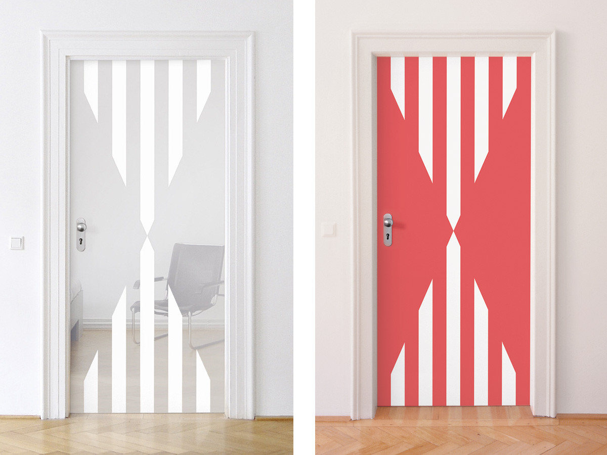
From Door Cycle
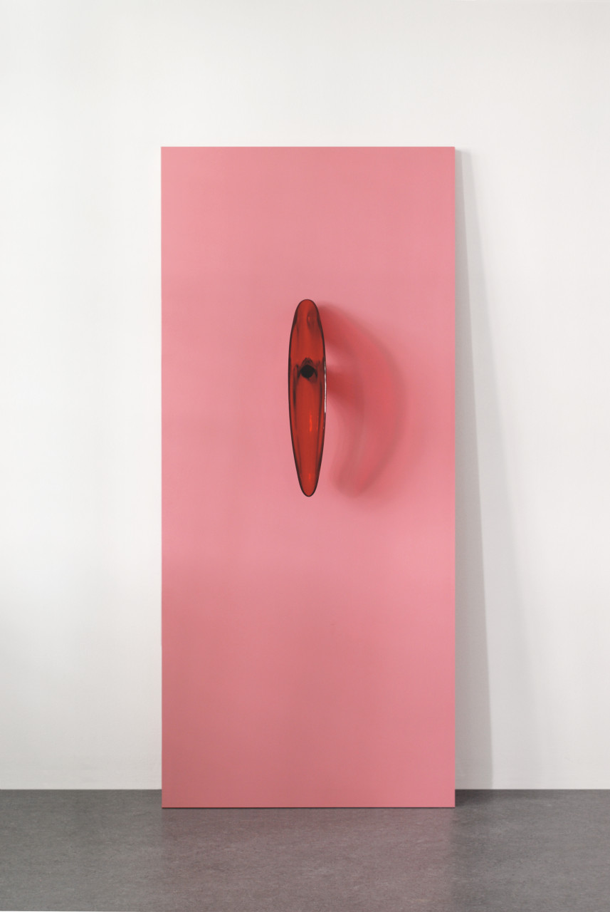
Glass door with translucent and opaline foil concealed between two sheets of security glass. Sizes vary with installation in architecture. Example shown here: 220 x 95.7 cm (86½ x 37½ in). Edition: 15, each unique in color and/or size, signed and numbered on separate label.
JOSEPH KOSUTH
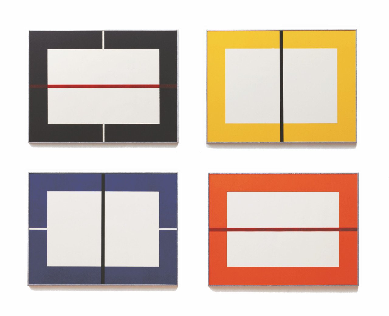
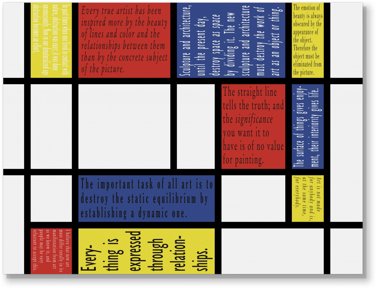
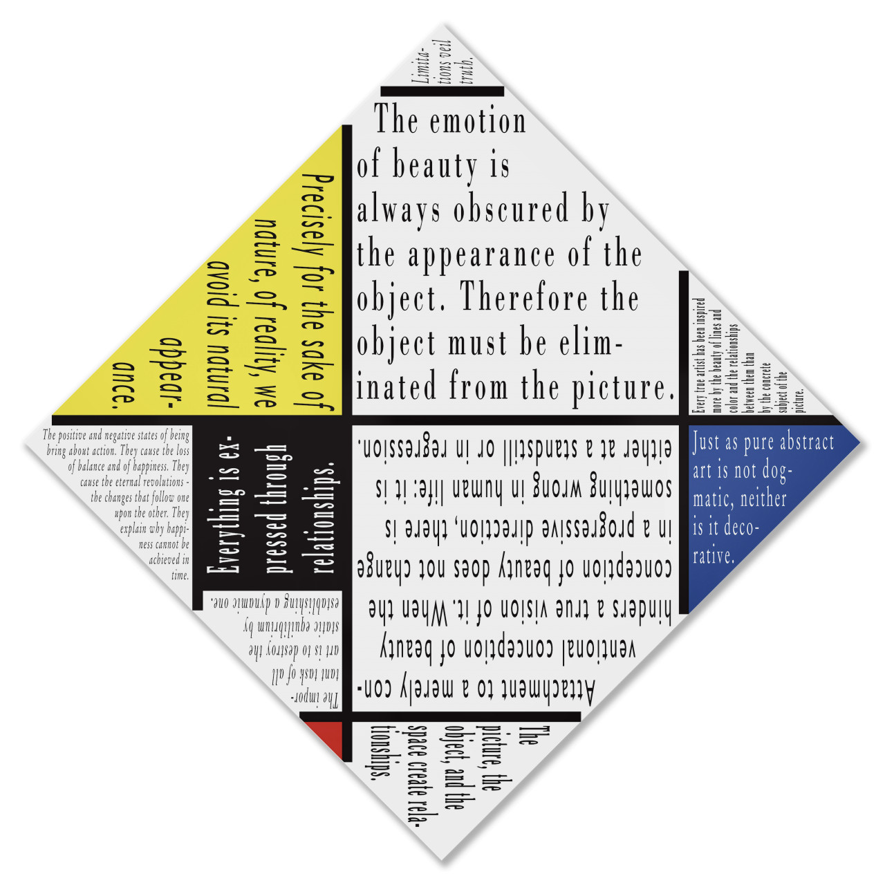
JS: “I have known Joseph Kosuth for quite some time and worked with him on some wonderful projects, including Sigla, Finnegans Wake, his contribution to the Wall Works series. Our most recent edition with him, a series of aluminium and paper works based on 16 neon works Joseph created between 2005 and 2015 that quote Piet Mondrian, may be my favourite yet. Joseph found a beautiful way to approach Piet Mondrian’s paintings on a conceptual level by placing quotes taken from Mondrian’s writings into the colour fields of his iconic compositions.”
A: UV digital pigment print with glossy protective coat on aluminum, mounted on aluminum frame; 45.2 x 60 x 1.3 cm (17.8 x 23.6 x 0.5 in)
B: Digital archival pigment print on Hahnemühle Photo Rag Ultrasmooth 305 g paper; 45.2 x 60 cm (17.8 x 23.6 in)
Each version: edition of 15 + 3 AP, signed and numbered on label verso
A: EUR 3,600
B: EUR 2,700
A: UV digital pigment print with glossy protective coat on aluminum, mounted on aluminum frame; 56 x 56 x 1.3 cm (22 x 22 x 0.5 in)
B: Digital archival pigment print on Hahnemühle Photo Rag Ultrasmooth 305 g paper; 56 x 56 cm (22 x 22 in)
Each version: edition of 15 + 3 AP, signed and numbered on label verso
A: EUR 3,600
B: EUR 2,700
From Sequences
Three-part aquatint and heliogravure on Rives BFK rag paper. Each print 40 x 50 cm (15¾ x 19¾ in), signed and numbered on second print. Edition of 60+X.
Set EUR 1,750
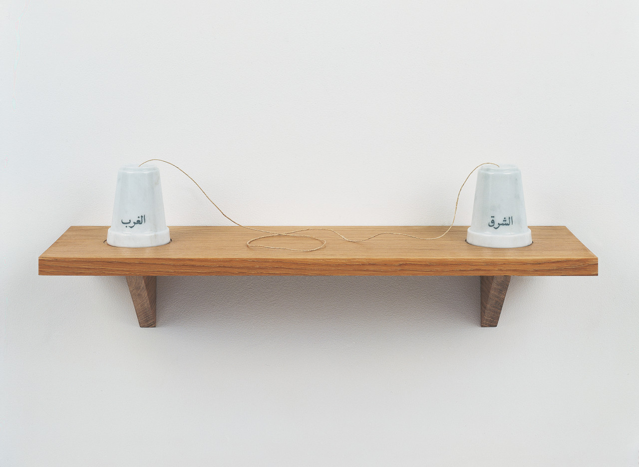
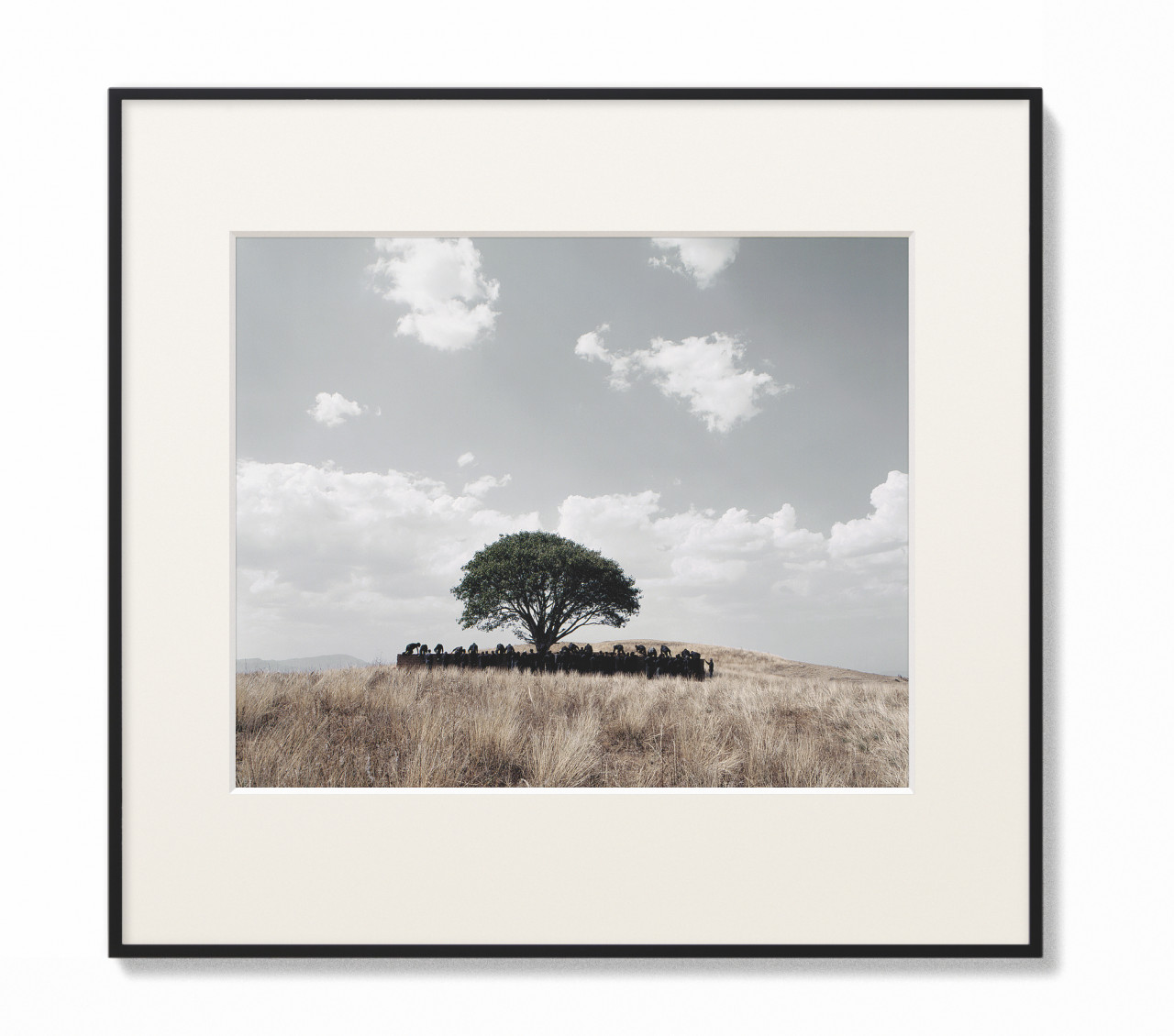
DOCUMENTA & BIENNALE VENICE
JS: “Schellmann Art published the official editions for the Documenta in 1997 and 2002 and for the Biennale Venice in 2003 and 2005. Working towards a deadline with several new artists could sometimes be a little challenging, but it was a wonderful opportunity to meet new artists and work with them for such a special occasion. I then continued to work with some of these artists, including Alfredo Jaar, Luc Tuymans, Michelangelo Pistoletto, Rosemarie Trockel, Candida Höfer, Monica Bonvicini, Mona Hatoum, Tony Oursler, and Shirin Neshat, on other edition projects.”
Published for Documenta 11
Transparency in light box, 35.5 x 96.5 x 9 cm (14 x 38 x 3½ in), edition of 30, signed and numbered.
EUR 8,000
Published for Documenta 11
Carrara marble, carved typography, string, oak wood shelf, 20 x 65 x 14 cm (8 x 25½ x 5½ in). Edition of 30, signed and numbered.
EUR 4,500
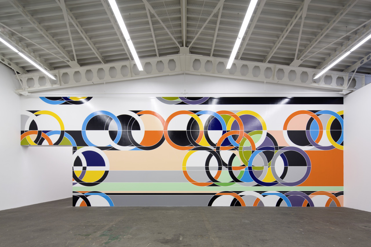
WALL WORKS
The Wall Works project commenced in the 1990s and aimed to establish a relationship with architecture, presenting art in the context of a surrounding space. This series was born of Schellmann’s interest in architectural installations, and how this could be realised as an edition. Artists were asked to create a conceptual design for a work to be executed professionally by skilled craftsmen in the specific space/wall of the buyer. The resulting wall works consist of many different media and combinations of media, including painting, installation of objects, wallpaper, photo, projection, light, drawing, typography, etc.
A signed and numbered certificate defines the wall work, giving all artistic and technical parameters and allowing for a small number (12-15 approximately) of executions. The designs allow for installation on walls of varying size and proportion according to the artist's exact specifications given in the certificate and in separate installation instructions.
The complete Wall Works series comprises over 50 unique wall works and is now part of the collection of Hamburger Bahnhof / Neue Nationalgalerie, Berlin.
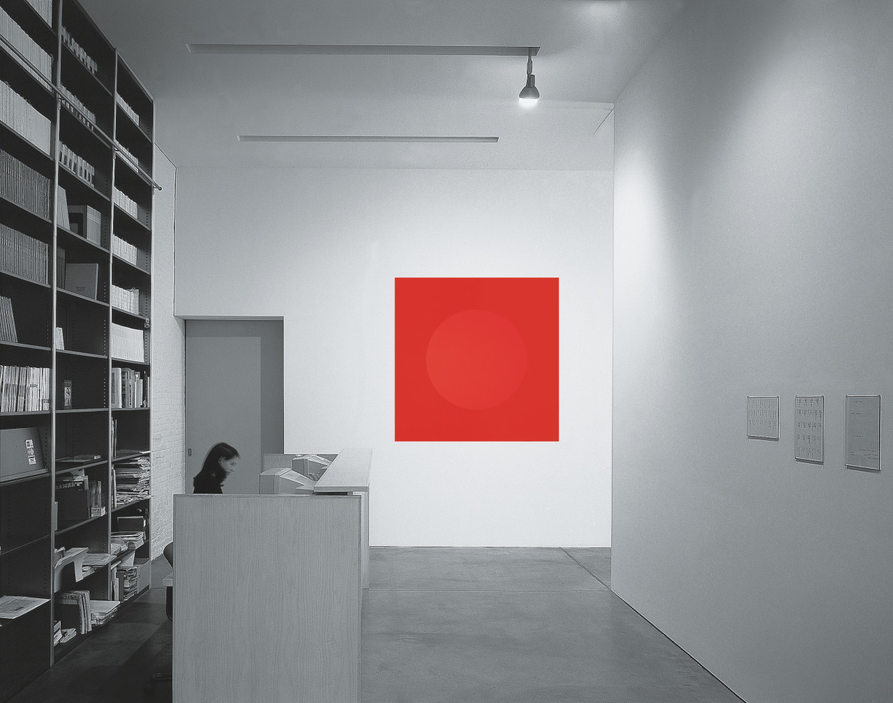
From Wall Works
A matte red circle 91 cm (36 in) within a glossy red square 150 x 150 cm (60 x 60 in), painted directly on the wall. Limited to one installation (unique). Certificate: text on paper, signed, and a diagram of the works in pencil or ink, 20 x 25 cm (8 x 10 in).
From Wall Works
Wall painting in Household Gloss Paint. Limited to 20 installations, with a signed and numbered certificate.
From Wall Works
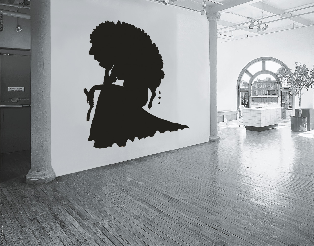
Wall painting in black; size 183 cm (6 ft) tall. Limited to 15 installations, with a signed and numbered certificate.
From Wall Works
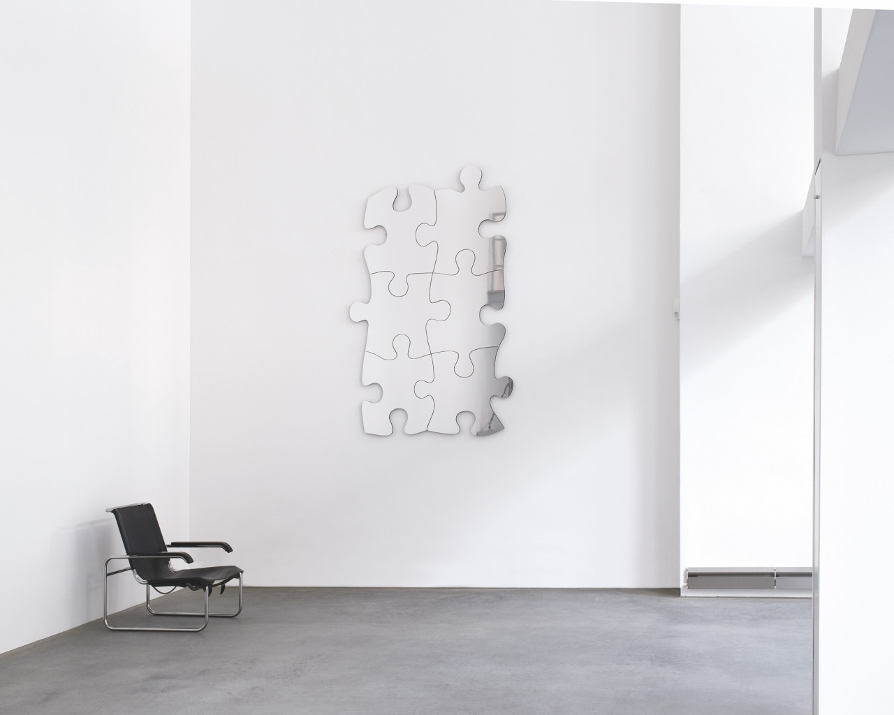
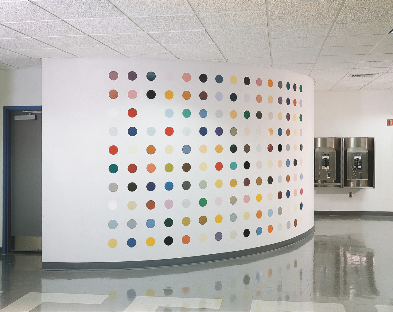
Six puzzle elements (MDF hardboard sandwiched between aluminum plates; mirror-polished front), 85 x 60 x 2.5 cm (33 x 24 x 1 in) each, on a white, gray, or black wall, mounted as a unit or displayed randomly. Limited to 15 installations, with a signed and numbered certificate.
From Wall Works
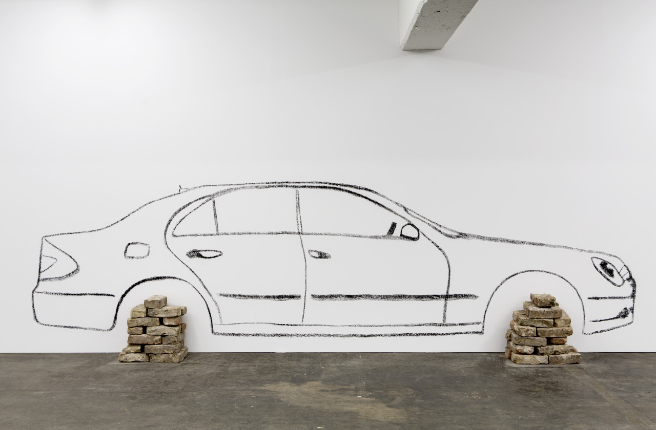
Wall drawing in black paint or charcoal, and bricks. Two different models of cars, BMW Wagon (stencil 452 cm) or Mercedes Sedan (stencil 487 cm), out of which one or several drawings can be installed. Limited to 15 installations, with a signed and numbered certificate giving specific instructions for on-site installation.
EUR 10,000
From Wall Works
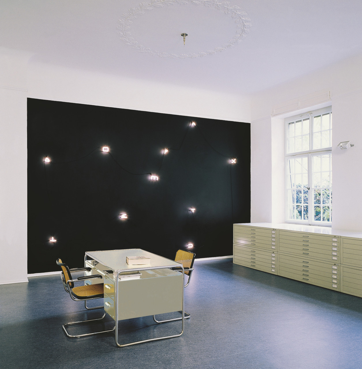
Warm white neon on a black painted wall; configuration of the neon signs variable. Signs approximately 12 x 12 x 4 cm (5 x 5 x 1½ in); installation size according to the wall. Limited to 12 installations, with a signed and numbered certificate.
From Wall Works
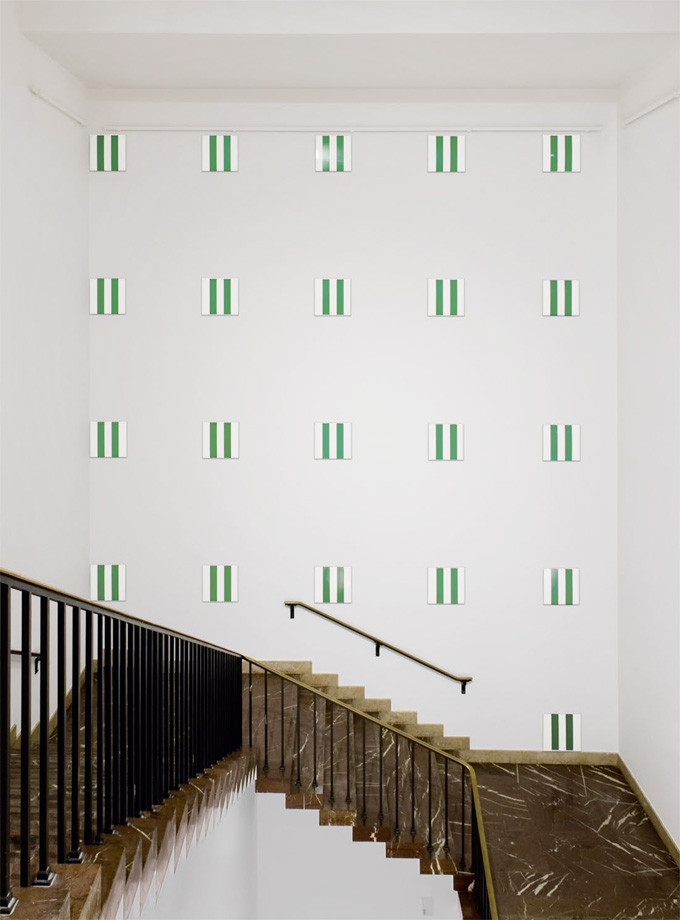
25 steel plates, enameled in two colors, to be mounted on a wall. Plates 43.5 x 43.5 cm each; installation size according to the wall. Limited to 15 installations, each unique in color, with a signed and numbered certificate.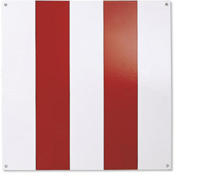
From Wall Works
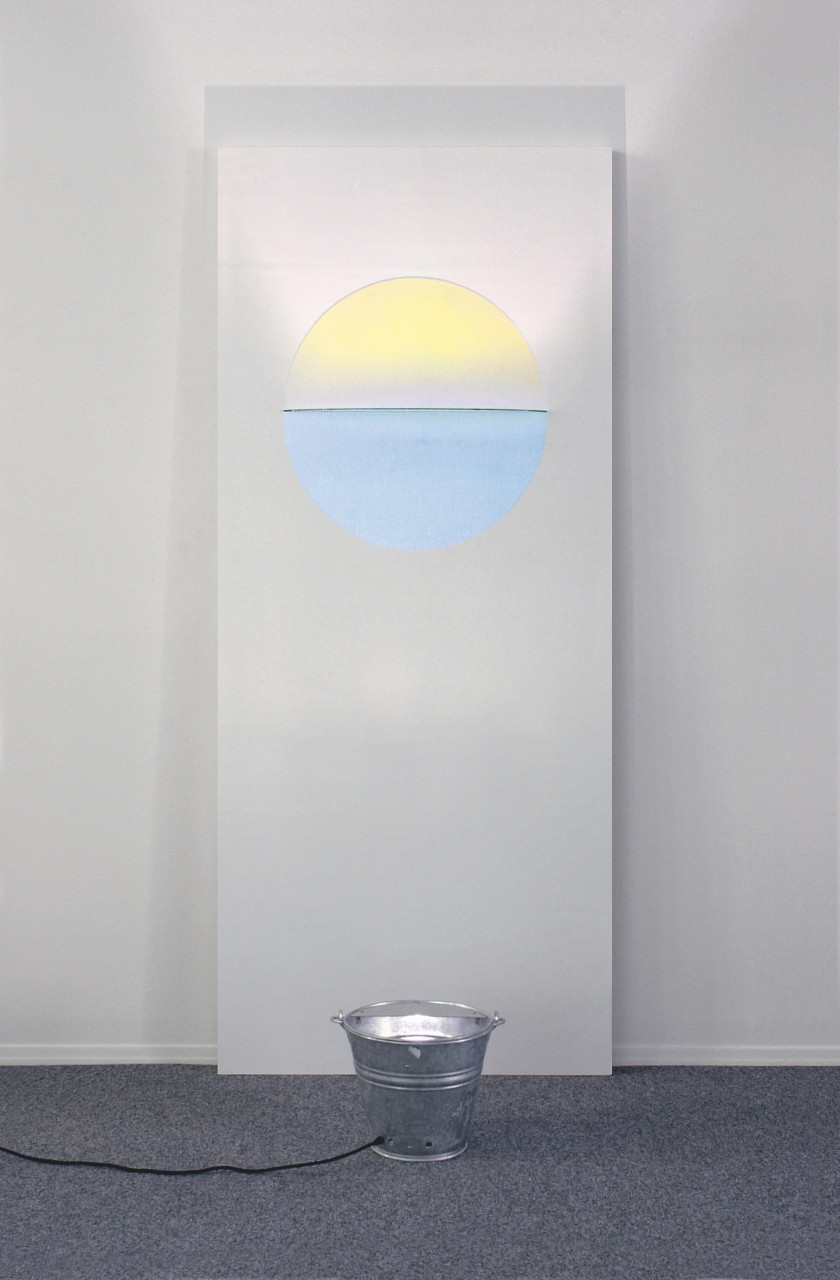
Warm white and daylight fluorescent light, two units 122 x 14 x 7.5 cm (48 x 5½ x 3 in) each; installation size according to the wall. Limited to an edition of 2, with a signed and numbered certificate (5 planned, only 2 made).
From Wall Works
Wall painting in enamel paint; size variable. Limited to 10 installations, each unique in color combination, with a signed and numbered certificate.
From Wall Works
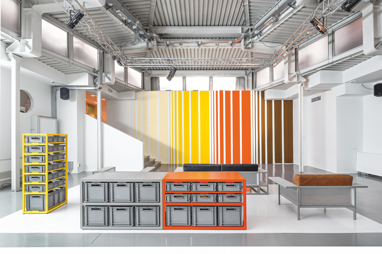
Wall painting in acrylic paint with floor to ceiling stripes in up to four colors according to the length of the wall. Limited to 15 installations, with a signed and numbered certificate giving specific instructions for on-site installation.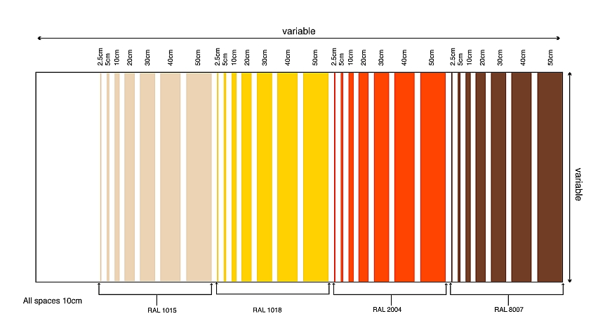
EUR 18,000
PUSHING THE LIMITS OF EDITIONS
Schellmann Art's variety and originality in terms of media and production techniques is almost unparalleled in the edition publishing world and makes for a particularly interesting portfolio of works. Jörg Schellmann’s desire to take edition publishing beyond the typical print and explore different materials and techniques has resulted in group projects like Wall Works or the Door Cycle, diverse collaborations with Keith Haring or Nam June Paik and numerous other wall objects and installations, handmade collages or light boxes. Due to their three-dimensionality, unfamiliar techniques and often no need for a frame, many of these works are close to unique works in their appearance and character.
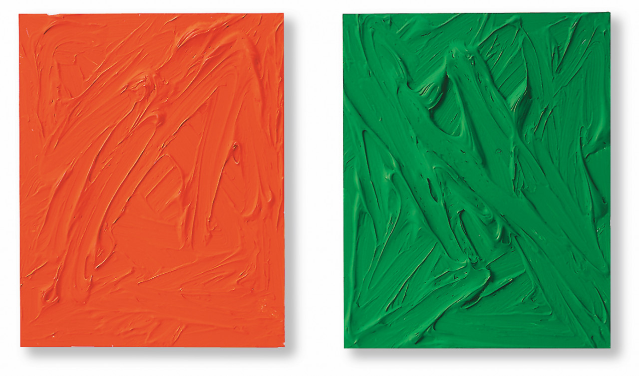
Two-part painting with acrylic and pigment paint on aluminium, each 50 x 40 x 3 cm (19¾ x 15¾ x 1 in).
Edition of 30 unique double paintings, each signed and numbered on verso.
Set EUR 3,000
From Wall Works
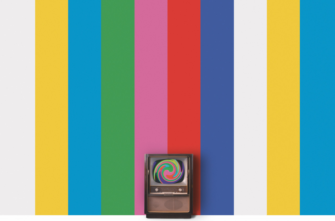
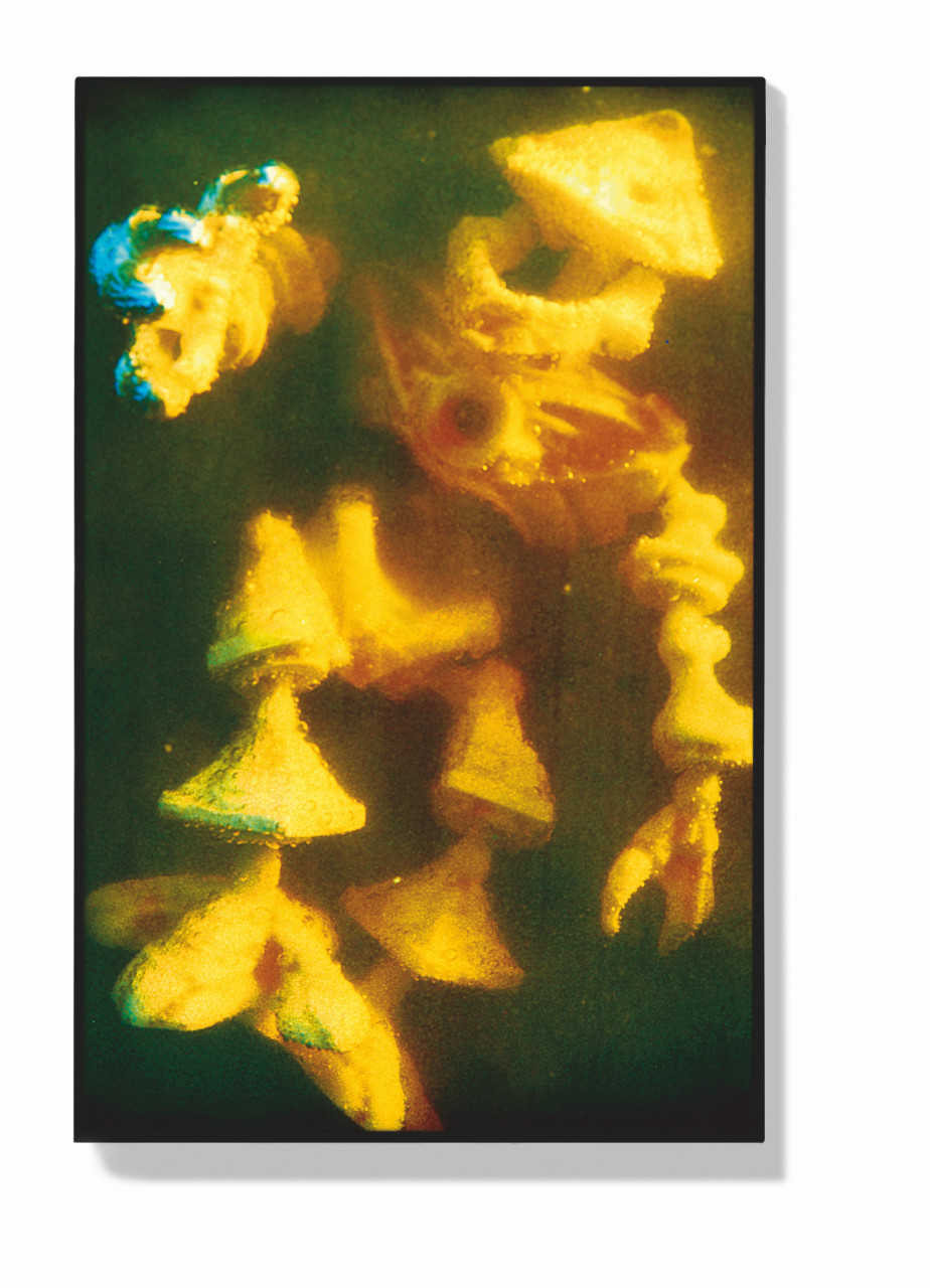
Wall painting in seven colors with an antique German TV playing the video Color Bar Theme and Variations. TV set varies in model within the edition, installation size according to the wall. Limited to 15 installations, with a signed and numbered certificate.
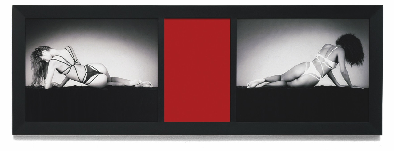
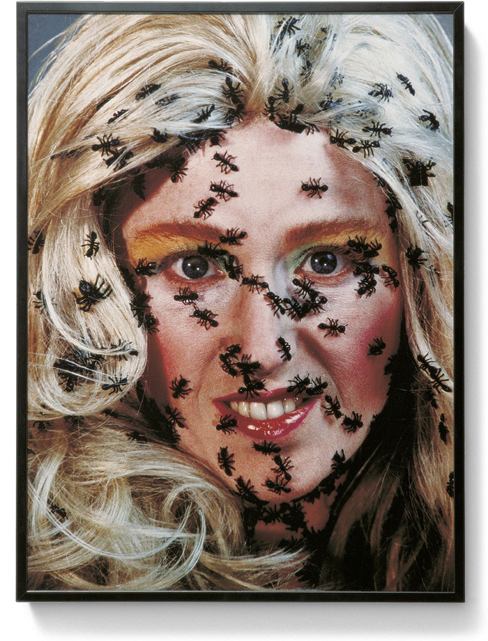
Two laminated gelatin silver prints and mirrored Plexiglas in five color variations (blue, red, smoke, violet, green) in a black wooden frame, 48.3 x 134.6 x 2.5 cm. Edition: 18, signed and numbered on label on verso of piece.
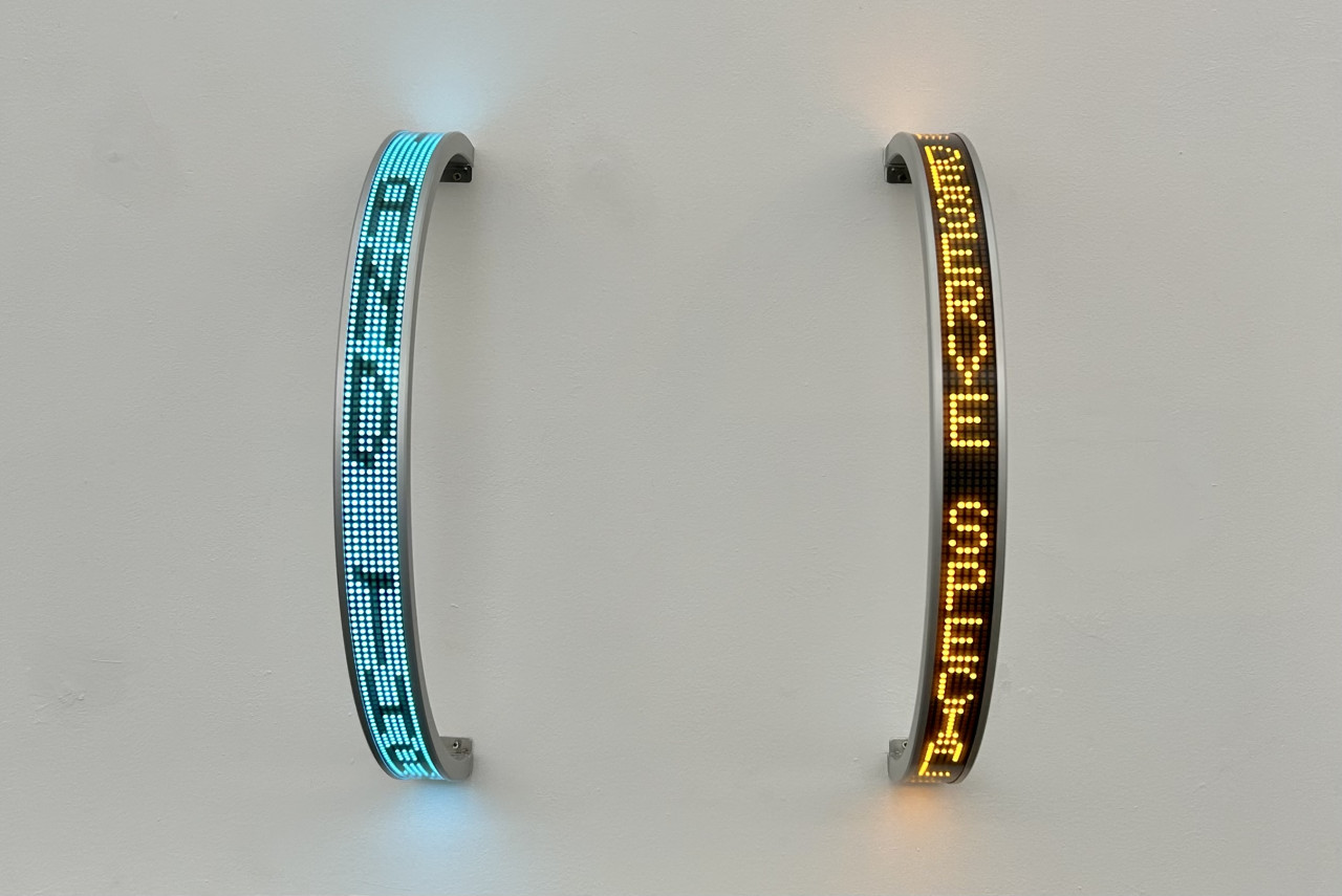
Semi-circular electronic LED sign, with amber (Amber Truisms Living) or blue (Blue Laments Arno) diodes, electro-polish aluminum housing with seamless light filter, each 5 x 53 x 2 cm (2 x 21 x ¾ in), to be installed horizontally or vertically (LED switches automatically). Edition of 25 each, signed and numbered.